Follow the Data

A data driven blog

Modelling tabular data with Google’s TabNet

Released in 2019, Google Research’s TabNet is claimed in a preprint manuscript to outperform existing methods on tabular data. How does it work and how can one try it?

Tabular data probably make up the majority of business data today. Think of things like retail transactions, click stream data, temperature and pressure sensors in factories, KYC information… the variety is endless.

In another post, I introduced CatBoost, one of my favorite methods for building prediction models on tabular data, and its neural network counterpart, NODE. But around the same time as the NODE manuscript came out, Google Research released a manuscript taking a totally different approach to tabular data modelling with neural networks. Whereas NODE mimics decision tree ensembles, Google’s proposed TabNet tries to build a new kind of architecture suitable for tabular data.

The paper describing the method is called TabNet: Attentive Interpretable Tabular Learning, which nicely summarizes what the authors are trying to do. The “Net” part tells us that it is a type of neural network, the “Attentive” part implies it is using an attention mechanism, it aims to be interpretable, and it is used for machine learning on tabular data.

How does it work?

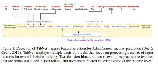
TabNet uses a kind of soft feature selection to focus on just the features that are important for the example at hand. This is accomplished through a sequential multi-step decision mechanism. That is, the input information is processed top-down in several steps. As the manuscript puts it, The idea of top-down attention in sequential form is inspired from its applications in processing visual and language data such as for visual question answering (Hudson & Manning, 2018) or in reinforcement learning (Mott et al., 2019) while searching for a small subset of relevant information in high dimensional input.

The building blocks for performing this sequential attention are called transformer blocks even though they are a bit different from the transformers used in popular NLP models such as BERT. The soft feature selection is accomplished by using the sparsemax function.

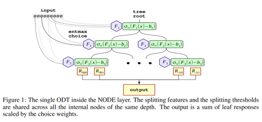
The first figure from the paper, reproduced below, sketches how information is aggregated to form a prediction.

Screenshot from 2020-01-13 21-55-05

One nice property of TabNet is that it does not require feature preprocessing (in contrast to e.g. NODE). Another one is that it has interpretability built in “for free” in that the most relevant features are selected for each example. This means that you don’t have to apply an external explanation module such as shap or LIME.

It is not so easy to wrap one’s head around what is happening inside this architecture when reading the paper, but luckily there is published code which clarifies things a bit and shows that it is not as complicated as you might think.

How can I use it?


The original code and modifications

As already mentioned, the code is available, and the authors show how to use it together with the forest covertype dataset. To facilitate this, they have provided three dataset-specific files: one file that downloads and prepares the data (download_prepare_covertype.py), another one that defines the appropriate Tensorflow Feature Columns and a CSV reader input function (data_helper_covertype.py), and the file that contains the training loop (experiment_covertype.py).

The repo README states:

To modify the experiment to other tabular datasets:

– Substitute the train.csv, val.csv, and test.csv files under “data/” directory,

– Modify the data_helper function with the numerical and categorical features of the new dataset,

– Reoptimize the TabNet hyperparameters for the new dataset.

After having gone through this process a couple of times with other datasets, I decided to write my own wrapper code to streamline the process. This code, which I must stress is a totally unofficial fork, is on GitHub.

In terms of the README points above:

  • Rather than making new train.csv, val.csv and test.csv files for each dataset, I preferred to read the entire dataset and do the splitting in-memory (as long as it is feasible, of course), so I wrote a new input function for Pandas in my code.
  • It can take a bit of work to modify the data_helper.py file, at least initially when you aren’t quite sure what it does and how the feature columns should be defined (this was certainly the case with me). There are also many parameters which need to be changed but which are in the main training loop file rather than the data helper file. In view of this, I also tried to generalize and streamline this process in my code.
  • I added some quick-and-dirty code for doing hyperparameter optimization, but so far only for classification.
  • It is also worth mentioning that the example code from the authors only shows how to do classification, not regression, so that extra code also has to be written by the user. I have added regression functionality with a simple mean squared error loss.

Using the command-line interface

Execute a command like:

python train_tabnet.py \
  --csv-path data/adult.csv \
  --target-name "<=50K" \
  --categorical-features workclass,education,marital.status,\
occupation,relationship,race,sex,native.country\
  --feature_dim 16 \
  --output_dim 16 \
  --batch-size 4096 \
  --virtual-batch-size 128 \
  --batch-momentum 0.98 \
  --gamma 1.5 \
  --n_steps 5 \
  --decay-every 2500 \
  --lambda-sparsity 0.0001 \
  --max-steps 7700

The mandatory parameters are — -csv-path(pointing to the location of the CSV file),--target-name(the name of the column with the prediction target) and--categorical-featues (a comma-separated list of the features that should be treated as categorical). The rest of the input parameters are hyperparameters that need to be optimized for each specific problem. The values shown above, though, are taken directly from the TabNet manuscript, so they have already been optimized for the Adult Census dataset by the authors.

By default, the training process will write information to the tflog subfolder of the location where you execute the script. You can point tensorboard at this folder to look at training and validation stats:

tensorboard --logdir tflog

and point your web browser to localhost:6006.

If you don’t have a GPU…

… you could try this Colaboratory notebook. Note that if you want to look at the Tensorboard logs, your best bet is probably to create a Google Storage bucket and have the script write the logs there. This is accomplished by using the tb-log-locationparameter. E.g. if your bucket’s name were camembert-skyscrape, you could add--tb-log-location gs://camembert-skyscraperto the invocation of the script. (Note, though, that you have to set the permissions for the storage bucket correctly. This can be a bit of a hassle.)

Then you can point tensorboard, from your own local computer, to that bucket:

tensorboard --logdir gs://camembert-skyscraper

Hyperparameter optimization

There is also a quick-and-dirty script for doing hyperparameter optimization in the repo (opt_tabnet.py). Again, an example is shown in the Colaboratory notebook. The script only works for classification so far, and it is worth noting that some training parameters are still hard-coded although they shouldn’t really be (for example, the patience parameter for early stopping [how many steps do you continue while the best validation accuracy does not improve].)

The parameters that are varied in the optimization script are N_steps, feature_dim, batch-momentum, gamma, lambda-sparsity. (output_dim is set to be equal to feature_dim, as suggested in the optimization tips just below.)

The paper has the following tips on hyperparameter optimization:

Most datasets yield the best results for N_steps ∈ [3, 10]. Typically, larger datasets and more complex tasks require a larger N_steps. A very high value of N_steps may suffer from overfitting and yield poor generalization.

Adjustment of the values of Nd [feature_dim] and Na [output_dim] is the most efficient way of obtaining a trade-off between performance and complexity. Nd = Na is a reasonable choice for most datasets. A very high value of Nd and Na may suffer from overfitting and yield poor generalization.

An optimal choice of γ can have a major role on the overall performance. Typically a larger N_steps value favors for a larger γ.

A large batch size is beneficial for performance — if the memory constraints permit, as large as 1–10 % of the total training dataset size is suggested. The virtual batch size is typically much smaller than the batch size.

Initially large learning rate is important, which should be gradually decayed until convergence.

Results

I’ve tried TabNet via this command line interface for several datasets, including the Adult Census dataset that I used in the post about NODE and CatBoost for reasons that can be found in that post. Conveniently, this dataset had also been used in the TabNet manuscript, and the authors present the best parameter settings they found there. With repeated runs using those setting, I noticed that the best validation error (and test error) tends to be at around 86%, similar to CatBoost without hyperparameter tuning. The authors report a test set performance of 85.7% in the manuscript. When I did hyperparameter optimization with hyperopt, I unsurprisingly reached a similar performance around 86%, albeit with a different parameter setting.

For other datasets such as the Poker Hand dataset, TabNet is claimed to beat other methods by a considerable margin. I have not yet devoted much time to that, but everyone is of course invited to try TabNet with hyperparameter optimization on various datasets for themselves!

Conclusions

TabNet is an interesting architecture that seems promising for tabular data analysis. It operates directly on raw data and uses a sequential attention mechanism to perform explicit feature selection for each example. This property also gives it a sort of built-in interpretability.

I have tried to make TabNet slightly easier to work with by writing some wrapper code around it. The next step is to compare it to other methods across a wide range of datasets.

Please try it on your own datasets and/or send pull requests and help me improve the interface if you are interested!


Modelling tabular data with CatBoost and NODE

CatBoost from Yandex, a Russian online search company, is fast and easy to use, but recently researchers from the same company released a new neural network based package, NODE, that they claim outperforms CatBoost and all other gradient boosting methods. Can this be true? Let’s find out how to use both CatBoost and NODE!

Who is this blog post for?

Although I wrote this blog post for anyone who is interested in machine learning and in particular tabular data, it is helpful if you are familiar with Python and the scikit-learn library if you want to follow along with the code. If you aren’t, hopefully you will find the theoretical and conceptual parts interesting anyway!

CatBoost introduction

CatBoost is my go-to package for modelling tabular data. It is an implementation of gradient boosted decision trees with a few tweaks that make it slightly different from e.g. xgboost or LightGBM. It works for both classification and regression problems.

Some nice things about CatBoost:

  • It handles categorical features (get it?) out of the box, so you don’t need to worry about how to encode them.
  • It typically requires very little parameter tuning.
  • It avoids certain subtle types of data leakage that other methods may suffer from. 
  • It is fast, and can be run on GPU if you want it to go even faster.

These factors make CatBoost, for me, a no-brainer as the first thing to reach for when I need to analyze a new tabular dataset.

Technical details of CatBoost

Skip this section if you just want to use CatBoost!

On a more technical level, there are some interesting things about how CatBoost is implemented. I highly recommend the paper Catboost: unbiased boosting with categorical features if you are interested in the details. I just want to highlight two things.

  1. In the paper, the authors show that standard gradient boosting algorithms are affected by subtle types of data leakage which result from the way that the models are iteratively fitted. In a similar manner, the most effective ways to encode categorical features numerically (like target encoding) are prone to data leakage and overfitting. To avoid this leakage, CatBoost introduces an artificial timeline according to which the training examples arrive, so that only “previously seen” examples can be used when calculating statistics.
  2. CatBoost actually doesn’t use regular decision trees, but oblivious decision trees. These are trees where, at each level of the tree, the same feature and the same splitting criterion is used everywhere! This sounds weird, but has some nice properties. Let’s look at what is meant by this.
Left: Regular decision tree. Any feature or split point can be present at each level. Right: Oblivious decision tree. Each level has the same splits.

In a normal decision tree, feature to split on and the cutoff value both depend on what path you have taken so far in the tree. This makes sense, because we can use the information we already have to decide the most informative next question (like in the “20 questions” game). With oblivious decision trees, the history doesn’t matter; we pose the same question no matter what. The trees are called “oblivious” because they keep “forgetting” what has happened before. 

Why is this useful? One nice property of oblivious decision trees is that an example can be classified or scored really quickly – it is always the same N binary questions that are posed (where N is the depth of the tree). This can easily be done in parallel for many examples. That is one reason why CatBoost is fast. Another thing to keep in mind is that we are dealing with a tree ensemble here. As a stand-alone algorithm, the oblivious decision tree might not work so well, but the idea of tree ensembles is that a coalition of weak learners often works well because errors and biases are “washed out”. Normally, the weak learner is a standard decision tree, and here it is something even weaker, namely the oblivious decision tree. The CatBoost authors argue that this particular weak base learner works well for generalization.

Installing CatBoost

Although installing CatBoost should be a simple matter of typing

pip install catboost

I’ve sometimes encountered problems with that when on a Mac. On Linux systems such as the Ubuntu system I am typing on now, or on Google Colaboratory, it should “just work”. If you keep having problems installing it, consider using a Docker image, e.g.

docker pull yandex/tutorial-catboost-clickhouse
docker run -it yandex/tutorial-catboost-clickhouse

Using CatBoost on a dataset

Link to Colab notebook with code

Let’s have a look at how to use CatBoost on a tabular dataset. We start by downloading a lightly preprocessed version of the Adult/Census Income  dataset which is, in the following, assumed to be located in datasets/adult.csv. I chose this dataset because it has a mix of categorical and numerical features, a nice manageable size in the tens of thousands of examples and not too many features. It is often used to exemplify algorithms, for instance in Google’s What-If Tool and many other places.  

The adult census dataset has the columns ‘age’, ‘workclass’, ‘education’, ‘education-num’, ‘marital-status’, ‘occupation’, ‘relationship’, ‘race’, ‘sex’, ‘capital-gain’, ‘capital-loss’, ‘hours-per-week’, ‘native-country’, and ‘<=50K‘. The task is to predict the value of the last column, ‘<=50K’, which indicates if the person in question earns 50,000 USD or less per year (the dataset is from 1994). We regard the following features as categorical rather than numerical: ‘workclass’, ‘education’, ‘marital-status’, ‘occupation’, ‘relationship’, ‘race’, ‘sex’, ‘native-country’.

The code is pretty similar to scikit-learn except for the Pool datatype that CatBoost uses to bundle feature and target values for a dataset while keeping them conceptually separate. (I have to admit I don’t really know why Pool is there – I just use it, and it seems to work fine.)

The code is available on Colab, but I will copy it here for reference. CatBoost needs to know which features are categorical and will then handle them automatically. In this code snippet, I also use 5-fold (stratified) cross-validation to estimate the prediction accuracy.

from catboost import CatBoostClassifier, Pool
from hyperopt import fmin, hp, tpe
import pandas as pd
from sklearn.model_selection import StratifiedKFold

df = pd.read_csv("https://docs.google.com/uc?" + 
                 "id=10eFO2rVlsQBUffn0b7UCAp28n0mkLCy7&" + 
                 "export=download")
labels = df.pop('<=50K')

categorical_names = ['workclass', 'education', 'marital-status',
                     'occupation', 'relationship', 'race',
                     'sex', 'native-country']  
categoricals = [df.columns.get_loc(i) for i in categorical_names]

nfolds = 5
skf = StratifiedKFold(n_splits=nfolds, shuffle=True)
acc = []

for train_index, test_index in skf.split(df, labels):
  X_train, X_test = df.iloc[train_index].copy(), \
                    df.iloc[test_index].copy()
  y_train, y_test = labels.iloc[train_index], \
                    labels.iloc[test_index]
  train_pool = Pool(X_train, y_train, cat_features = categoricals)
  test_pool = Pool(X_test, y_test, cat_features = categoricals)
  model = CatBoostClassifier(iterations=100,
                             depth=8,
                             learning_rate=1,
                             loss_function='MultiClass') 
  model.fit(train_pool)
  predictions = model.predict(test_pool)
  accuracy = sum(predictions.squeeze() == y_test) / len(predictions)
  acc.append(accuracy)

mean_acc = sum(acc) / nfolds
print(f'Mean accuracy based on {nfolds} folds: {mean_acc:.3f}')
print(acc)

What we tend to get from running this (CatBoost without hyperparameter optimization) is a mean accuracy between 85% and 86%. In my last run, I got about 85.7%.

If we want to try to optimize the hyperparameters, we can use hyperopt (if you don’t have it, install it with pip install hyperopt). In order to use it, you need to define a function that hyperopt tries to minimize. We will just try to optimize the accuracy here. Perhaps it would be better to optimize e.g. log loss, but that is left as an exercise to the reader 😉 

The main parameters to optimize are probably the number of iterations, the learning rate, and the tree depth. There are also many other parameters related to over-fitting, for instance early stopping rounds and so on. Feel free to explore on your own!

# Optimize between 10 and 1000 iterations and depth between 2 and 12

search_space = {'iterations': hp.quniform('iterations', 10, 1000, 10),
                'depth': hp.quniform('depth', 2, 12, 1),
                'lr': hp.uniform('lr', 0.01, 1)
               }

def opt_fn(search_space):

  nfolds = 5
  skf = StratifiedKFold(n_splits=nfolds, shuffle=True)
  acc = []

  for train_index, test_index in skf.split(df, labels):
    X_train, X_test = df.iloc[train_index].copy(), \
                      df.iloc[test_index].copy()
    y_train, y_test = labels.iloc[train_index], \
                      labels.iloc[test_index]
    train_pool = Pool(X_train, y_train, cat_features = categoricals)
    test_pool = Pool(X_test, y_test, cat_features = categoricals)

    model = CatBoostClassifier(iterations=search_space['iterations'],
                             depth=search_space['depth'],
                             learning_rate=search_space['lr'],
                             loss_function='MultiClass',
                             od_type='Iter')

    model.fit(train_pool, logging_level='Silent')
    predictions = model.predict(test_pool)
    accuracy = sum(predictions.squeeze() == y_test) / len(predictions)
    acc.append(accuracy)

  mean_acc = sum(acc) / nfolds
  return -1*mean_acc

best = fmin(fn=opt_fn, 
            space=search_space, 
            algo=tpe.suggest, 
            max_evals=100)

When I last ran this code, it took over 5 hours but resulted in a mean accuracy of 87.3%, which is on par with the best results I got when trying the Auger.ai AutoML platform.

Sanity check: logistic regression

At this point we should ask ourselves if these fancy new-fangled methods are really needed. How would a good old logistic regression perform out of the box and after hyperparameter optimization?

I’ll omit reproducing the code here for brevity’s sake, but it is available in the same Colab notebook as before. One detail with the logistic regression implementation is that it doesn’t handle categorical variables out of the box like CatBoost does, so I decided to code them using target encoding, specifically leave-one-out target encoding, which is the approach taken in NODE and a fairly close though not identical analogue of what happens in CatBoost.

Long story short, untuned logistic regression with this type of encoding yields around 80% accuracy, and around 81% (80.7% in my latest run) after hyperparameter tuning. Here, an interestin alternative is to try automated preprocessing libraries such as vtreat and Automunge, but I will save those for an upcoming blog post!

Taking stock

What do we have so far, before trying NODE?

  • Logistic regression, untuned: 80.0%
  • Logistic regression, tuned: 80.7%
  • CatBoost, untuned: 85.7%
  • CatBoost, tuned: 87.2%


NODE: Neural Oblivious Decision Ensembles

A recent manuscript from Yandex researchers describes an interesting neural network version of CatBoost, or at least a neural network take on oblivious decision tree ensembles (see the technical section above if you want to remind yourself what “oblivious” means here.) This architecture, called NODE, can be used for either classification or regression.

One of the claims from the abstract reads: “With an extensive experimental comparison to the leading GBDT packages on a large number of tabular datasets, we demonstrate the advantage of the proposed NODE architecture, which outperforms the competitors on most of the tasks.” This naturally piqued my interest. Could this tool be better than CatBoost?

How does NODE work?

You should go to the paper for the full story, but some relevant details are:

  • The entmax activation function is used as a soft version of a split in a regular decision tree. As the paper puts it, The entmax is capable to produce sparse probability distributions, where the majority of probabilities are exactly equal to 0. In this work, we argue that entmax is also an appropriate inductive bias in our model, which allows differentiable split decision construction in the internal tree nodes. Intuitively, entmax can learn splitting decisions based on a small subset of data features (up to one, as in classical decision trees), avoiding undesired influence from others.” The entmax functions allows a neural network to mimic a decision tree-type system while keeping the model differentiable (weights can be updated based on the gradients).
  • The authors present a new type of layer, a “node layer”, which you can use in a neural network (their implementation is in PyTorch). A node layer represents a tree ensemble.
  • Several node layers can be stacked, yielding a hierarchical model where the input is fed through one tree ensemble at a time. Successive concatenation of input representations can be used to give a model which is reminiscent of the popular DenseNet model for image processing, just specialized in tabular data.
  • The parameters of a NODE model are:
    • Learning rate (always 0.001 in the paper)
    • The number of node layers (k)
    • The number of trees in each layer (m)
    • The depth of the trees in each layer (d)


How is NODE related to tree ensembles?

To get a feeling for how the analogy between this neural network architecture and decision tree ensembles looks, Figure 1 is reproduced here.

Screenshot from 2020-01-12 16-34-38

How should the parameters be chosen?

There is not much guidance in the manuscript; the authors suggest using hyperparameter optimization. They do mention that they optimize over the following space:

  • num layers: {2, 4, 8} 
  • total tree count: {1024, 2048} 
  • tree depth: {6, 8} 
  • tree output dim: {2, 3}

In my code, I don’t do grid search but rather let hyperopt sample values within certain ranges. The way I thought about it (which could be wrong) is that each layer represents a tree ensemble (a single instance of CatBoost, let’s say). For each layer that you add, you may add some representation power, but you also make the model much heavier to train and potentially risk overfitting. The total tree count seems roughly analogous to the number of trees in CatBoost/xgboost/random forests, and has the same tradeoffs: with many trees, you can express more complicated functions, but the model will take much longer to train and risk overfitting. The tree depth, again, has the same type of tradeoff. As for the output dimensionality, frankly, I don’t quite understand why it is a parameter. Reading the paper, it seems it should be equal to one for regression and equal to the number of classes for classification.

How does one use NODE?

The authors have made code available on GitHub. They do not provide a command-line interface but rather suggest that users run their models in the provided Jupyter notebooks. One classification example and one regression example is provided in those notebooks.

The repo README page also strongly suggests using a GPU to train NODE models. (This is a factor in favor of CatBoost.) 

I have prepared a Colaboratory notebook with some example code on how to run classification on NODE and how to optimize hyperparameters with hyperopt. 

Please move to the Colaboratory notebook right now to keep following along! 

Here I will just highlight some parts of the code.

General problems adapting the code

The problems I encountered when adapting the authors’ code were mainly related to data types. It’s important that the input datasets (X_train and X_val) are arrays (numpy or torch) in float32 format; not float64 or a mix of float and int. The labels need to be encoded as long (int64) for classification, and float32 for regression. (You can see this handled in the cell titled “Load, split and preprocess the data”.)

Other problems were related to memory. The models can quickly blow up the GPU memory, especially with the large batch sizes used in the authors’ example notebooks. I solved this simply by using the maximum batch size I could get away with on my laptop (and later, on Colab).

In general, though, it was not that hard to get the code to work. The documentation was a bit sparse, but sufficient.


Categorical variable handling

Unlike CatBoost, NODE does not support categorical variables, so you have to prepare those yourself into a numerical format. We do it for the Adult Census dataset in the same way the NODE authors do it, using LeaveOneOutEncoder from the category_encoders library. Here we just use a regular train/test split instead of 5-fold CV out of convenience, as it takes a long time to train NODE (especially with hyperparameter optimization).

from category_encoders import LeaveOneOutEncoder
import numpy as np
import pandas as pd
from sklearn.model_selection import train_test_split

df = pd.read_csv('https://docs.google.com/uc' + 
                 '?id=10eFO2rVlsQBUffn0b7UCAp28n0mkLCy7&' + 
                 'export=download')
labels = df.pop('<=50K')
X_train, X_val, y_train, y_val = train_test_split(df,
                                                  labels,
                                                  test_size=0.2)

class_to_int = {c: i for i, c in enumerate(y_train.unique())}                                                                                                               
y_train_int = [class_to_int[v] for v in y_train]                                                                                                                            
y_val_int = [class_to_int[v] for v in y_val] 

cat_features = ['workclass', 'education', 'marital-status',
                'occupation', 'relationship', 'race', 'sex',
                'native-country']
  
cat_encoder = LeaveOneOutEncoder()
cat_encoder.fit(X_train[cat_features], y_train_int)
X_train[cat_features] = cat_encoder.transform(X_train[cat_features])
X_val[cat_features] = cat_encoder.transform(X_val[cat_features])

# Node is going to want to have the values as float32 at some points
X_train = X_train.values.astype('float32')
X_val = X_val.values.astype('float32')
y_train = np.array(y_train_int)
y_val = np.array(y_val_int)

Now we have a fully numeric dataset. 

Model definition and training loop

The rest of the code is essentially the same as in the authors’ repo (except for the hyperopt part). They created a Pytorch layer called DenseBlock, which implements the NODE architecture. A class called Trainer holds information about the experiment, and there is a straightforward training loop that keeps track of the best metrics seen so far and plots updated loss curves.

Results & conclusions

With some minimal trial and error, I was able to find a model with around 86% validation accuracy. After hyperparameter optimization with hyperopt (which was supposed to run overnight on a GPU in Colab, but in fact timed out after about 40 iterations), the best performance was 87.2%. In other runs I have achieved 87.4%. In other words, NODE did outperform CatBoost, albeit slightly, after hyperopt tuning.

However, accuracy is not everything. It is not convenient to have to do costly optimization for every dataset. 

Pros of NODE vs CatBoost:

  • It seems that slightly better results can be obtained (based on the NODE paper and this test; I will be sure to try many other datasets!)

Pros of CatBoost vs NODE:

  • Much faster
  • Less need of hyperparameter optimization
  • Runs fine without GPU
  • Has support for categorical variables

Which one would I use for my next projects? Probably CatBoost will still be my go-to tool, but I will keep NODE in mind and maybe try it just in case…

It’s also important to realize that performance is dataset-dependent and that the Adult Census Income dataset is not representative of all scenarios. Perhaps more importantly, the preprocessing of categorical features is likely rather important in NODE. I’ll return to the subject of preprocessing in a future post!


Model explanation followup – anchors, Shapley values, counterfactuals etc.

Last year, I published a blog post about model explanations (a term I will use interchangeably with “model interpretation” here, although there might be some subtle differences.) Just eleven months later, so much has happened in this space that that blog post looks completely obsolete. I suspect part of the surge in interest in model interpretation techniques is partly due to the recently introduced GDPR regulations, partly due to pure momentum from a couple of influential papers. Perhaps practitioners have also started to realize that customers or other model users frequently want to have the option of peeking into the “black box”. In this post, I’ll try to provide some newer and better resources on model explanation and briefly introduce some new approaches.

Context

This update deals with “black-box” explanation methods which should work on any type of predictive model and the aim of which is to provide the user of a predictive model with a useful explanation of why a certain prediction was made. In other words, I am talking about local rather than global explanations.

Out of scope for this post are neural network-specific and/or image-oriented methods such Grad-CAM, Understanding the inner workings of neural networks,  etc. I also don’t include things like RandomForestExplainer although I like it, because it is used for global investigation of feature importance rather than explaining single predictions.

I’ll assume that you have read the previous post and have at least heard about LIME, which has been an influential model interpretation method in the past few years. Although many methods preceded it, the LIME authors were successful in communicating its usefulness and arguing in favor of its approach. To summarize very briefly what LIME does, it attempts to explain a specific prediction by building a local, sparse, linear surrogate model around that data point and returning the nonzero coefficients of the fit. It does this by creating a “fake” data set by sampling new points around the point to be explained, classifying those points with the model, and then fitting a lasso model to the new “fake” (x, y) set of points. There are some further details, e.g. the contribution of each point to the loss depends on its distance from the original point, and there is also a penalty for having a complex model – please see the “Why should I trust you?” paper for details.

General sources

I’ve found this ebook, Interpretable Machine Learning, written by Christoph Molnar, a PhD student in Germany, to be really useful. It goes into the reasons for thinking about model interpretability as well as technical details on partial dependence plots, feature importance, feature interactions, LIME and SHAP.

The review paper “A Survey Of Methods For Explaining Black Box Models” by Guidotti et al. does a pretty good job of explaining all the nuances of different types if explanatory models. It also discusses some much earlier, interesting model explanation approaches.

O’Reilly have released an ebook, “An Introduction to Machine Learning Interpretability” which is available via Safari (you can read it via a free trial). I haven’t had time to read it yet, but trust it is good based on the authors’ (they are from H2O) previous blog posts on the subject, such as Ideas on Interpreting Machine Learning.

New methods

(1) SHAP

Probably my personal favorite of the methods I’ve tried so far, SHAP (SHapley Additive exPlanations) is based on a concept from game theory called Shapley values. These values reflect the optimal way of distributing credit in a multiplayer game based on how much each player contributes to some payoff in the game. In a machine learning context, you can see features as “players” and the payoff as being a prediction (or the difference between a prediction and a naïve baseline prediction.) There is a great blog post by Cody Marie Wild that explains this in more detail, and also a double episode of the Linear Digressions podcast which is well worth a listen.

Maybe even more important than the sound theoretical underpinnings, SHAP has a good Python interface with great plots built in. It plugs in to standard scikit-learn type predictors (or really anything you want) with little hassle. It is especially good for tree ensemble models (random forest, gradient boosting). For these models, there are effective ways of calculating Shapley values without running into combinatorial explosion, and therefore even very big datasets can be visualized in terms of each data point’s Shapley value if a tree ensemble has been used.

(1b) Shapley for deep learning: Integrated gradients

For deep learning models, there is an interface for Keras that allows for calculating Shapley score-like quantities using “integrated gradients” (see paper “Axiomatic Attribution for Deep Networks“), which is basically a way to calculate gradients in a way that does not violate one of the conditions (“sensitivity”) of feature attribution. This is done by aggregating gradients over a straight-line path between the point to explain and a reference points.

(2) Counterfactual explanations

A paper from last year, “Counterfactual Explanations Without Opening the Black Box: Automated Decisions and the GDPR“, comes at the problem from a slightly different angle which reflects that it was written by a data ethicist, a computer scientist, and a lawyer. It discusses under what conditions an explanation of a prediction is required by GDPR and when it is actually meaningful to the affected person. They arrive at the conclusion that the most useful way to explain a prediction is a counterfactual that changes the input variables as little as possible while ending up with a different prediction. For example, if you are denied a loan by an automated algorithm, it might be sufficient to learn that you would have gotten the loan if your income had been 5% higher. This leads to a method where one looks for “the closest possible world” where the decision would have been different. I.e. one tries to find a point as close as possible to the data point under explanation where the algorithm would have chosen a different class.

(3) Anchors

The group that published LIME has extended their work after noticing that the LIME explanations can have unclear coverage, ie it is not clear whether a given explanation applies in a region where an unseen instance is located. They have written a new paper, “Anchors: High-Precision Model-Agnostic Explanations“, which deals with “anchors”, high-precision explanation rules that “anchor” a prediction locally so that changes to the rest of the feature’s values don’t matter. On instances where the anchor holds, the prediction is (almost) always the same. (The degree to which it has to hold can be controlled with a parameter.). This tends to yield compact rules that are also easily understood by users. There is a Python interface for anchors.

I’d be happy to hear about other interesting explanation methods that I’ve missed!

Personal reflections on data science jobs

A bit more than a year ago, I took the plunge and left my academic job to try my luck as a corporate data scientist, first at IBM (obviously a very big company) and now at Peltarion (a startup which I still want to call small although it is growing rapidly). I am not sure if this blog post is premature or not, but in any case I’d like to share some of my experiences and impressions of the different roles I’ve been in. So without further ado, I present my three last data science positions!

(1) Bioinformatics scientist at Stockholm university (May 2010- May 2017) + freelance gigs.

I was working as a senior bioinformatician at SciLifeLab/Stockholm University in different capacities for seven years. At first I was hired as a general bioinformatics go-to person in a so-called core facility that does DNA sequencing, where I would be involved in a lot of different kinds of things: setting up data pipelines, deciding on quality control routines, trying to figure out what had gone wrong, delivering data to and communicating with customers, performing routine or custom analysis, and sometimes doing some actual research and writing papers. After a while, I moved into a different role where my job was more explicitly to help researchers with data analysis, statistics and programming – more research-oriented and long-term work. In a way, I was an academic data science consultant. Of course, we didn’t really call it “data science” because we were doing science, plain and simple, but in terms of what we did all day, it was in many ways similar to “data science” in industry.

Characteristics of data science in an academic (biology) setting

Note: this is the type of role I have the most experience with, or the most data on, if you will, so I am more confident about the pronouncements here than in the other categories.

  • The final product is almost always a paper. This has some positive and negative implications. On the good side, there is (at least nowadays) a strong focus on reproducibility. On the bad side, there is almost no emphasis on putting predictive models into production or making them easily usable. Code quality can also be spotty as a result.
  • Bioinformatics data scientists tend to be good at data visualization, often in R or Python. They understand the concept of batch effects (drift in distribution parameters) and are good at dealing with high-dimensional data where the number of examples is usually much smaller than the number of dimensions (n << p), for example datasets with measurements of 20,000 genes for 20 different individuals. This makes it necessary for bioinformatics data scientists to be familiar with dimensionality reduction and multivariate methods such as PCA, PLS, t-SNE and so on.
  • They like to use notebooks (Jupyter or R Markdown) to communicate analyses, because these have a similar structure to scientific presentations or manuscripts.
  • They often like to use pipelining tools such as Nextflow, Snakemake or Bpipe to chain operations together.

During this time, I was also consulting part-time (usually less than 10%) for a few startups. From one of these gigs I learned to build very complex processing pipelines with Snakemake. From another, I learned to build obscure functionality for web applications in Shiny. These are both tools that fit naturally into a bioinformatician’s mindset. For yet another customer, I suggested a way to use PCA and MDS to view their data from a global point of view which they had not considered, guiding them onto a path that eventually resulted in this Medium article.


(2) Senior Data Scientist at IBM (June-November 2017).

After having been an academic consultant for quite a while, I decided to try to be a corporate one for a change. I got a position at IBM’s consulting arm, Global Business Services, in Kista outside of Stockholm. Since I was only there for six months, I only had time to participate in a handful of projects, which were mostly related to the manufacturing industry. Fortunately, the knowledge of high-dimensional data that I had from biology came in good stead when working on these problems. It was not difficult to apply the skills I had obtained from academia in this setting.

Characteristics of data science in a “big consulting” setting

Note: With my short experience, I have a hard time isolating out for some of the points below if they are true in general for consulting companies or company (IBM in this case) specific.

  • Pragmaticism is the word to summarize data science in “big consulting”. There isn’t time to think through every wrinkle of a problem as there is (albeit in theory only) in academia. The end goal is specified by a contract which you try to fulfill as closely as possible within the allotted amount of time. Notably, your task is not to do as much as possible but to do exactly what has been agreed upon. There is almost always a trade-off between time and model performance.
  • Consultants are good at giving effective presentations. One of the first things I learned was to completely rework the way I had done presentations in academia to more clearly highlight the important findings and tailor them for the management level in companies. Communication is a very important skill for a data science consultant; maybe the most important one.
  • Like in academia, there is also not that much emphasis on productization, because that part will typically be handled by a software engineering team that comes in after you have completed a proof of concept (PoC), if that PoC leads to a longer engagement. On the other hand the IBM stack (see below) has good support for deploying models e.g. via NodeRed.
  • (This part might be more or less company-specific) In my team, we did not make very much use of code version control with Github, for a couple of different reasons. Since we worked mostly with short PoC projects, it was more prioritized to find a promising approach in the allotted time, after which the software engineering team would come in to build the final implementation given a prolonged contract. Also, some of my colleagues worked mainly with non-code tools such as SPSS Modeler, which has its own built-in version control. We ensured reproducibility mainly through the version control mechanism in Box, where we stored scripts, documentation and metadata.
  • Automated data cleaning and model building (AutoML) are important in this setting because of the time constraints. Data cleaning can yield big “quick wins” but is tedious and a lot can be gained by automating it, for example with packages such as vtreat for R. AutoML with TPOT, auto-sklearn or H20 is interesting for rapidly finding a good-enough model.
  • Feature importance or other types of model explanation are very important for communicating results to customers (also see below). Decision trees are still used surprisingly often, and for random forests and gradient boosting, there is feature importance and various tree-model explanation interfaces.
  • It’s quite common to encounter projects with unbalanced data and to use tools like SMOTE, ADASYN or ROSE to do smart oversampling of the rare class(es). It is also not uncommon that some classes are so rare that one needs to go for an anomaly detection approach rather than standard classification.
  • (Company specific, at least in part) In terms of tooling, there was a larger emphasis on using commercial products (preferably from the IBM ecosystem) such as SPSS Modeler rather than open-source programming languages. Naturally, one has to rapidly become conversant with Bluemix (now called IBM Cloud) offerings and associated products in order to be an effective IBM consultant.


(3) Data scientist at Peltarion (Nov 2017-).

In the autumn of 2017, I got an offer from a deep learning company, Peltarion, that I had applied to before starting at IBM. I decided to take it on the strength of the skills of my new colleagues, many of whom I knew from the Stockholm AI and machine learning scene. As the company is a startup, I have worn many hats during the first six months, working in customer projects, writing documentation and blog posts, testing our deep learning platform, sitting together with beta testers, keeping an eye on competitors and so on.

Characteristics of data science in a startup setting: (surely not representative of all startups…)

Note: I suspect that the variance among startups is much higher than among academic groups or big consulting companies, so almost everything here is probably highly company-specific.

  • (Possibly company-specific) There is more emphasis on software engineering practices and than academia or big consulting. Git and Github (or some equivalent) are not “nice-to-haves” but the core of the whole enterprise, and frequent pull requests and code reviews much more common. Virtual environments and containers (e g Docker) are important (though also found in academic bioinformatics to a large extent.)
  • Data scientists in startups tend to think more about deployment and productization of models, because it hits closer to home (there often isn’t a supporting software engineering team to do that for the data scientists, or the startup is building its own deployment functionality, like we are at Peltarion).
  • (Possibly company-specific) Startup data scientists tend to be more informed about the latest technical advances in machine learning. Consultants don’t have time to keep up as much (or to install and play with the latest tools) and academics are often more interested in keeping up with the latest scientific advances in their specific field rather than general ML news. It is also more important to keep track of competitors.
  • (Possibly company-specific, e.g. Spotify uses Luigi) Reproducibility is achieved by writing libraries rather than chaining together operations with pipelines. Continuous integration (CI), like with Travis or Jenkins, is much more common than in academia, although it is starting to appear there as well. For us at Peltarion, CI is essential because we need to move fast and make every effort to minimize technical debt that could come back and bite us in the future.

I hope you enjoyed this highly subjective look at different kinds of data scientist positions. Feel free to ask questions in the comments section or provide your own views on different roles.


Explaining and interpreting predictive models

A couple of years ago, I participated in a workshop on academic data science at SICS in Stockholm. At that event, we discussed various trends in data science and machine learning and at the end of it, I participated in a discussion group, led by professor Niklas Lavesson from Blekinge Institute of Technology, where we talked about model interpretability and explanation. At the time, it felt like a fringe but interesting topic. Today, this topic seems to be all over the place. Here are some of the places I’ve seen it recently.

Blog posts and presentations

Interpretable Machine Learning: The fuss, the concrete and the questions (pdf link). This 125-page (!) presentation is from a tutorial given at ICML 2017 in Sydney the other day. It gives a useful overview of how to think about interpretability in machine learning.

Ideas on interpreting machine learning. This is a very thorough blog post from O’Reilly with a lot of good ideas. It also talks about related things such as dimensionality reduction which I would not call model explanation per se, but which are still good to know.

Fast Forward Labs have announced a new report on interpretable machine learning. (I have not read the actual report.)

Papers with software

Understanding Black-box Predictions via Influence Functions. The paper of this name (associated code here) won a best-paper award at ICML 2017 (again showing how hot this topic is!). The authors use something called an influence function to quantify, roughly speaking, how much a perturbation of a single example in the training data set affects the resulting model. In this way, they can identify the training data points most responsible for a given prediction. One might say that they have figured out a way to differentiate a predictive model with respect to data points in the training set.

LIME, Local Interpretable Model-agnostic Explanations. (arXiv link, code on Github) This has been around for more than a year and can thus be called “established” in the rapidly changing world of machine learning. I have tried it myself for a consulting gig and found it useful for understanding why a certain prediction was made. The main implementation is in Python but there is also a good R port (which is what I used when I tried it.) LIME essentially builds a simplified local model around the data point you are interested in. It does this by perturbing real training data points, obtaining the predicted label for those perturbed points, and fitting a sparse linear model to those points and labels. (As far as I have understood, that is!)

I’m sure I have missed a lot of interesting work.

If anyone is interested, I might write another blog post illustrating how LIME can be used to understand why a certain prediction was made on a public dataset. I might even try to explain the influence function paper if I get the time to try it and digest the math.

Temperature forecast showdown: YR vs SMHI

Attention conservation notice: This may mostly be interesting for Nordics.

Many of us in the Nordics are a bit obsessed with the weather. Especially during summer, we keep checking different weather apps or newspaper prognoses to find out whether we will be able to go to the beach or have a barbecue party tomorrow. In Sweden, the main source of predictions is the Swedish Meteorological and Hydrological Institute, but many also use for instance the Klart.se site/app, which uses predictions from the Finnish company Foreca. The Norwegian Meteorological Institute’s yr.no site is also popular.

Various kinds of folk lore exists around these prognoses, for instance one often hears that the ones from the Norwegian Meteorological Institute (at yr.no) are better than those from the Swedish equivalent (at smhi.se)

As a hobby project, we decided to test this claim, focusing on Stockholm as that is where we currently live. We started collecting data in May 2016, so we now (July 2017) have more than one year’s worth of data to check how well the two forecasts perform.

The main task we considered was to predict the temperature in Stockholm (Bromma, latitude 59.3, longitude 18.1) 24 hours in advance. As SMHI and YR usually don’t publish forecasts at exactly the same times, we can’t compare them directly data point by data point. However, we do have the measured temperature recorded hourly, so we can compare each forecast from either SMHI or YR to the actual temperature.

Methods

SMHI forecasts were downloaded through their API via this URL every fourth hour using crontab.

YR forecasts were downloaded through their API via this URL every fourth hour using crontab.

Measured temperatures were downloaded from here hourly using crontab.

Results

First, some summary statistics. On the whole, there are no dramatic differences between the two forecasting agencies. It is clear that SMHI is not worse than YR on predicting the temperature in Stockholm 24h in advance (probably not significantly better either, judging from some preliminary statistical tests conducted on the absolute deviations of the forecasts from the actual temperatures).

Both institutes are doing well in terms of correlation (Pearson and Spearman correlation ~0.98 between forecast and actual temperature). The median absolute deviation is 1, meaning that the most typical error is to get the temperature wrong by one degree Celsius in either direction. The mean squared error is around 2.5 degrees for both.

Forecaster Correlation with measured temperature Mean squared error Median absolute deviation Slope in linear model Intercept in linear model
SMHI 0.982 2.37 1 1.0 0.254
YR 0.980 2.51 1 1.0 0.141

Let’s take a look at how this looks visually. Here is a plot of SMHI predictions vs temperatures measured 24 hours later. There are about 2400 data points here (6 per day, and a bit more than a year’s worth of data). The color indicates the density of points in that part of the plot.

SMHI_vs_measured.png

And here is the corresponding plot for YR forecasts.

YR_vs_measured

Again, there are about 2400 data points here.

Unfortunately, those 2400 data points are not exactly for the same times in the SMHI and YR datasets, because the two agencies do not publish forecasts for exactly the same times (at least the way we collected the data). Therefore we only have 474 data points where both SMHI and YR had made forecasts for the same time point 24h into the future. Here is a plot of how those forecasts look.

both

So what?

This doesn’t really say that much about weather forecasting unless you are specifically interested in Stockholm weather. However, the code can of course be adapted and the exercise can be repeated for other locations. We just thought it was a fun mini-project to check the claim that there was a big difference between the two national weather forecasting services.

Code and data

If anyone is interested, I will put up code and data on GitHub. Leave a message here, on my Twitter or email.

Possible extensions

Accuracy in predicting rain (probably more useful).
Accuracy as a function of how far ahead you look.

Repost: The big picture of public discourse on Twitter by clustering metadata

Note: this is a re-post of an analysis previously hosted at mindalyzer.com. Originally published in late December 2016, this blog post was later followed up by this extended analysis on Follow the Data.

The big picture of public discourse on Twitter by clustering metadata | Mindalyzer

Authors: Mattias Östmar, mattiasostmar (a) gmail.com, Mikael Huss, mikael.huss (a) gmail.com

Summary: We identify communities in the Swedish twitterverse by analyzing a large network of millions of reciprocal mentions in a sample of 312,292,997 tweets from 435,792 twitter accounts in 2015 and show that politically meaningful communities among others can be detected without having to read or search for specific words or phrases.

Background

Inspired by Hampus Brynolf’s Twittercensus, we wanted to perform a large-scale analysis of the Swedish Twitterverse, but from a different perspective where we focus on discussions rather than follower statistics.

All images are licensed under Creative Commons CC-BY (mention the source) and the data is released under Creative Commons Zero which means you can freely download and use it for your own purposes, no matter what. The underlaying tweets are restricted by Twitters Developer Agreement and Policy and cannot be shared due to their restrictions, which are mainly there to protect the privacy of all Twitter users.

Method

Code pipeline

A pipeline connecting the different code parts for reproducing this experiment is available at github.com/hussius/bigpicture-twitterdiscouse.

The Dataset

The dataset was created by continously polling Twitter’s REST API for recent tweets from a fixed set of Twitter accounts during 2015. The API gives out tweets from before the polling starts as well, but Twitter does not document how those are selected. A more in depth description of how the dataset was created and what it looks like can be found at mindalyzer.com.

Graph construction

From the full dataset of tweets, the tweets originating from 2015 was filtered out and a network of reciprocal mentions was created by parsing out any at-mentions (e.g. ‘@mattiasostmar’) in them. Retweets of others people’s tweets have not been counted, even though they might contain mentions of other users. We look at reciprocal mention graphs, where a link between two users means that both have mentioned each other on Twitter at least once in the dataset (i.e. addressed the other user with that user’s Twitter handle, as happens by default when you reply to a Tweet, for instance). We take this as a proxy for a discussion happening between those two users. The mention graphs were generated using the NetworkX package for Python. We naturally model the graph as undirected (as both users sharing a link are interacting with each other, there is no notion of directionality) and unweighted. One could easily imagine a weighted version of the mention graph where the weight would represent the total number of reciprocal mentions between the users, but we did not feel that this was needed to achieve interesting results.

The final graph consisted of 377.545 nodes (Twitter accounts) and 15.862.275 edges (reciprocal mentions connecting Twitter accounts). The average number of reciprocal mentions for nodes in the graph was 42. The code for the graph creation can be found here and you can also download the pickled graph in NetworkX-format (104,5MB, license:CCO).

The visualizations of the graphs were done in Gephi using the Fruchterman Reingold layout algoritm and thereafter adjusting the nodes with the Noverlap algorithm and finally the labels where adjusted with the algoritm Label adjust. Node size were set based on the ‘importance’ measure that comes out of the Infomap algoritm.

Community detection

In order to find communities in the mention graph (in other words, to cluster the mention graph), we use Infomap, an information-theory based approach to multi-level community detection that has been used for e.g. mapping of biogeographical regions such as Edler, Etal 2015 and scientific publications such as Rosvall, Bergström 2010, among many examples. This algorithm, which can be used both for directed and undirected, weighted and unweighted networks, allows for multi-level community detection, but here we only show results from a single partition into communities. (We also tried a multi-level decomposition, but did not feel that this added to the analysis presented here.)

“The Infomap algorithm returned a bunch of clusters along with a score for each user indicating how “central” that person was in the network, measured by a form of PageRank, which is the measure Google introduced to rank web pages. Roughly speaking, a person involved in a lot of discussions with other users who are in turn highly ranked would get high scores by this measure. For some clusters, it was enough to have a quick glance at the top ranked users to get a sense of what type of discourse that defines that cluster. To be able to look at them all we performed language analysis of each cluster’s users tweets to see what words were the most distinguishing. That way we also had words to judge the quaility of the clusters from.

What did we find?

We took the top 20 communities in terms of size, collected the tweets during 2015 from each member in those clusters, and created a textual corpus out of that (more specifically, a Dictionary using the Gensim package for Python). Then, for each community, we tried to find the most over-represented words used by people in that community by calculating the TF-IDF (term frequency-inverse document frequency) for each word in each community, and looking at the top 10 words for each community.

When looking at these overrepresented words, it was really easy to assign “themes” to our clusters. For instance, communities representing Norwegian and Finnish users (who presumably sometimes tweet in Swedish) were trivial to identify. It was also easy to spot a community dedicated to discussing the state of Swedish schools, another one devoted to the popular Swedish band The Fooo Conspiracy, and an immigration-critical cluster. In fact we have defined dozens of thematically distinct communities and continue to find new ones.

A “military defense” community

Number of nodes 1224
Number of edges 14254
Data (GEXF graph) Download (license: CC0)

One of the communities we found, which tends to discuss military defense issues and “prepping”, is shown in a graph below. This corresponds almost eerily well to a set of Swedish Twitter users highlighted in large Swedish daily Svenska Dagbladet Försvarstwittrarna som blivit maktfaktor i debatten. In fact, of their list of the top 10 defense bloggers, we find each and every one of them in our top 18. Remember that our analysis uses no pre-existing knowledge of what we are looking for: the defense cluster just fell out of the mention graph decomposition.

Top 10 accounts
1. Cornubot
2. wisemanswisdoms
3. patrikoksanen
4. annikanc
5. hallonsa
6. waterconflict
7. mikaelgrev
8. Spesam
9. JohanneH
10. Jagarchefen

Top distinguishing words (measured by TF-IDF:

#svfm
#säkpol
#fofrk
russian
#föpol
#svpol
ukraine
ryska
#ukraine
ryska
russia
nato
putin

The graph below shows the top 104 accounts in the cluster ranked by Infomap algorithm’s importance measure. You can also download a zoomable pdf.

Defence cluster top 104

Graph of “general pundit” community

Number of nodes 1100 (most important of 7332)
Number of edges 38684 (most important of 92332
Data (GEXF) Download (license: CC0)

The largest cluster is a bit harder to summarize easily than many of the other ones, but we think of it as a “pundit cluster” with influential political commentators, for example political journalists and politicians from many different parties. The most influential user in this community according to our analysis is @sakine, Sakine Madon, who was also the most influential Twitter user in Mattias eigenvector centrality based analysis of the whole mention graph (i.e. not divided into communities).

Accounts
1. Sakine
2. oisincantwell
3. RebeccaWUvell
4. fvirtanen
5. niklasorrenius
OhlyLars
7. Edward_Blom
8. danielswedin
9. Ivarpi
10. detljuvalivet

Top distinguishing words (measured by TF-IDF:

#svpol
nya
tycker
borde
läs
bättre
löfven
svensksåld
regeringen
sveriges
#eupol
jobb

The graph below shows the top 106 accounts in the cluster ranked by Infomap algorithm’s importance measure. You can also download a zoomable pdf.

pundits cluster top 106

Graph of “immigration” community

Number of nodes 2308)
Number of edges 33546
Data (GEXF) Download (license: CC0)

One of the larger clusters consists of accounts clearly focused on immigration issues judging by the most distinguishing words. An observation is that while all the larger Swedish political parties official Twitter accounts are located within the “general pundit” community, Sverigedemokraterna (The Sweden Democrats) that was born out of immigration critical sentiments is the only one of them located in this commuity. This suggests that they have (or at least had in the period up until 2015) an outsider position in the public discourse on Twitter that might or might not reflect such a position in the general public political discourse in Sweden. There is much debate and worry about filter bubbles formed by algorithms that selects what people get to see. Research such as Credibility and trust of information in online environments suggests that the social filtering of content is a strong factor for influence. Strong ties such as being part of a conversation graph such as this would most likely be an important factor in shaping of your world views.

Accounts
1. Jon_Brenelli
2. perraponken
3. sjunnedotcom
4. RolandXSweden
5. inkonsekvenshen
6. AnnaTSL
7. TommyFunebo
8. doppler3ffect
9. Stassministern
10. rogsahl

Top distiguishing words (TF-IDF):

#motgift
#natpol
#migpol
#dkpol
7-klövern
#svpbs
#artbymisen
#tcot
sanandaji
arnstad
massinvandring
#sdu14
#amazoncart
#ringp1
rlm
riktpunkt.nu:
#pkbor
tino
#pklogik
#nordiskungdom

immigration cluster top 102

Future work

Since we have the pipeline ready, we can easily redo it for 2016 when the data are in hand. Possibly this will reveal dynamical changes in what gets discussed on Twitter, and may give indications on how people are moving between different communities. It could also be interesting to experiment with a weighted version of the graph, or to examine a hierarchical decomposition of the graph into multiple levels.

2017 Mattias Östmar

License:
CC BY

Graciously supported by The Swedish Memetic Society

Dynamics in Swedish Twitter communities

TL;DR

I made a community decomposition of Swedish Twitter accounts in 2015 and 2016 and you can explore it in an online app.

Background

As reported on this blog a couple of months ago, (and also here). I have (together with Mattias Östmar) been investigating the community structure of Swedish Twitter users. The analysis we posted then addressed data from 2015 and we basically just wanted to get a handle on what kind of information you can get from this type of analysis.

With the processing pipeline already set up, it was straightforward to repeat the analysis for the fresh data from 2016 as soon as Mattias had finished collecting it. The nice thing about having data from two different years in that we can start to look at the dynamics – namely, how stable communities are, which communities are born or disappear, and how people move between them.

The app

First of all, I made an app for exploring these data. If you are interested in this topic, please help me understand the communities that we have detected by using the “Suggest topic” textbox under the “Community info” tab. That is an attempt to crowdsource the “annotation” of these communities. The suggestions that are submitted are saved in a text file which I will review from time to time and update the community descriptions accordingly.

The fastest climbers

By looking at the data in the app, we can find out some pretty interesting things. For instance, the account that easily increased to most in influence (measured in PageRank) was @BjorklundVictor, who climbed from a rank of 3673 in 2015 in community #4 (which we choose to annotate as an “immigration” community) to a rank of 3 (!) in community #4 in 2016 (this community has also been classified as an immigration-discussion community, and it is the most similar one of all 2016 communities to the 2015 immigration community.) I am not personally familiar with this account, but he must have done something to radically increase his reach in 2016.

Some other people/accounts that increased a lot in influence were professor Agnes Wold (@AgnesWold) who climbed from rank 59 to rank 3 in the biggest community, which we call the “pundit cluster” (it has ID 1 both in 2015 and 2016), @staffanlandin, who went from #189 to #16 in the same community, and @PssiP, who climbed from rank 135 to rank 8 in the defense/prepping community (ID 16 in 2015, ID 9 in 2016).

Some people have jumped to a different community and improved their rank in that way, like @hanifbali, who went from #20 in community 1 (general punditry) in 2015 to the top spot, #1 in the immigration cluster (ID 4) in 2016, and @fleijerstam, who went from #200 in the pundit community in 2015 to #10 in the politics community (#3) in 2016.

Examples of users who lost a lot of ground in their own community are @asaromson (Åsa Romson, the ex-leader of the Green Party; #7 -> #241 in the green community) and @rogsahl (#10 -> #905 in the immigration community).

The most stable communities

It turned out that the most stable communities (i.e. the communities that had the most members in common relative to their total sizes in 2015 and 2016 respectively) were the ones containing accounts using a different language from Swedish, namely the Norwegian, Danish and Finnish communities.

The least stable community

Among the larger communities in 2015, we identified the one that was furthest from having a close equivalent in 2016. This was 2015 community 9, where the most influential account was @thefooomusic. This is a boy band whose popularity arguably hit a peak in 2015. The community closest to it in 2016 is community 24, but when we looked closer at that (which you can also do in the app!), we found that many YouTube stars had “migrated” into 2016 cluster 24 from 2015 cluster 84, which upon inspection turned out to be a very clear Swedish YouTuber cluster with stars such as Clara Henry, William Spetz and Therese Lindgren.

So in other words, the The Fooo fan cluster and the YouTuber cluster from 2015 merged into a mixed cluster in 2016.

New communities

We were hoping to see some completely new communities appear in 2016, but that did not really happen, at least not for the top 100 communities. Granted, there was one that had an extremely low similarity to any 2015 community, but that turned out to be a “community” topped by @SJ_AB, a railway company that replies to a large number of customer queries and complaints on Twitter (which, by the way, makes it the top account of them all in terms of centrality.) Because this company is responding to queries from new people all the time, it’s not really part of a “community” as such, and the composition of the cluster will naturally change a lot from year to year.

Community 24, which was discussed above, was also dissimilar from all the 2015 communitites, but as described, we notice it has absorbed users from 2015 clusters 9 (The Fooo) and 84 (YouTubers).

Movement between the largest communities

The similarity score for the “pundit clusters” (community 1 in 2015 and community 1 in 2016, respectively) somewhat surprisingly showed that these were not very similar overall, although many of the top-ranked users are the same. A quick inspection also showed that the entire top list of community 3 in 2015 moved to community 1 in 2016, which makes the 2015 community 3 the closest equivalent to the 2016 community 1. Both of these communities can be characterized as general political discussion/punditry clusters.

Comparison: The defense/prepper community in 2015 vs 2016

In our previous blog post on this topic, we presented a top-10 list of defense Twitterers and compared that to a manually curated list from Swedish daily Svenska Dagbladet. Here we will present our top-10 list for 2016.

Username Rank in 2016 Rank in 2015 Community ID in 2016 Community ID in 2015
patrikoksanen 1 3 9 16
hallonsa 2 5 9 16
Cornubot 3 1 9 16
waterconflict 4 6 9 16
wisemanswisdoms 5 2 9 16
JohanneH 6 9 9 16
mikaelgrev 7 7 9 16
PssiP 8 135 9 16
oplatsen 9 11 9 16
stakmaskin 10 31 9 16

Comparison: The green community in 2015 vs 2016

One community we did not touch on in the last blog post is the green, environmental community. Here’s a comparison of the main influencers in that category in 2016 vs 2015.

Username Rank in 2016 Rank in 2015 Community ID in 2016 Community ID in 2015
rickardnordin 1 4 13 29
Ekobonden 2 1 13 109
ParHolmgren 3 19 13 29
BjornFerry 4 12 13 133
PWallenberg 5 12 13 109
mattiasgoldmann 6 3 13 29
JKuylenstierna 7 10 13 29
Axdorff 8 3 13 153
fores_sverige 9 11 13 29
GnestaEmma 10 17 13 29

Caveats

Of course, many parts of this analysis could be improved and there are some important caveats. For example, the Infomap algorithm is not deterministic, which means that you are likely to get somewhat different results each time you run it. For these data, we have run it a number of times and seen that you get results that are similar in a general sense each time (in terms of community sizes, top influencers and so on), but it should be understood that some accounts (even top influencers) can in some cases move around between communities just because of this non-deterministic aspect of the algorithm.

Also, it is possible that the way we use to measure community similarity (the Jaccard index, which is the ratio between the number of members in common between two communities and the number of members that are in any or both of the communities – or to put it in another way, the intersection divided by the union) is too coarse, because it does not consider the influence of individual users.

Data-intensive wellness companies

I had some trouble coming up with a term to describe the three companies that I will discuss here: Arivale, Q and iCarbonX. What they have in common (in my opinion) is that they

  • explicitly focus on individual’s health and wellness (wellness monitoring),
  • generate molecular and other data using many different platforms (multi-omics), resulting in tens or hundreds of thousands of measurements for each individual data point,
  • use or claim to use artificial intelligence/machine learning to reach their goals.

So the heading of this blog post could just as well have been for instance “AI wellness companies” or “Molecular wellness monitoring companies”. The point with using “data-intensive” is that they all generate much more extensive molecular data on their users (DNA sequencing, RNA sequencing, proteomics, metagenomics, …) than, say, WellnessFX, LifeSum or more niche wellness solutions.

I associate these three companies with three big names in genomics.

Arivale was founded by Leroy Hood, who is president of the Institute for Systems Biology and was involved in developing the automatization of DNA sequencing. In connection with Arivale, Hood as talked about dense dynamic data clouds that will allow individuals to track their health status and make better lifestyle decisions. Arivale’s web page also talks a lot about scientific wellness. They have different plans, including a 3,500 USD one-time plan. They sample blood, saliva and the gut microbiome and have special coaches who give feedback on findings, including genetic variants and how well you have done with your FitBit.

Q, or q.bio, (podcast about them here) seems to have grown out of Michael Snyder‘s work on iPOPs, “individual personal omics profiles“, which he first developed on himself as the first person to do both DNA sequencing, repeated RNA sequencing, metagenomics etc. on himself. (He has also been involved in a large number of other pioneering genomics projects.) Q’s web site and blog talks about quantified health and the importance of measuring your physiological variables regularly to get a “positive feedback loop”. In one of their blog posts, they talk about dentistry as a model system where we get regular feedback, have lots and lots of longitudinal data on people’s dental health, and therefore get continuously improving dental status at cheaper prices. They also make the following point: We live in a world where we use millions of variables to predict what ad you will click on, what movie you might watch, whether you are creditworthy, the price of commodities, and even what the weather will be like next week. Yet, we continue to conduct limited clinical studies where we try and reduce our understanding of human health and pathology to single variable differences in groups of people, when we have enormous evidence that the results of these studies are not necessarily relevant for each and every one of us.

iCarbonX, a Chinese company, was founded by (and is headed by) Wang Jun, the former wunderkid-CEO of Beijing Genomics Institute/BGI. A couple of years ago, he gave an interview to Nature where he talked about why he was stepping down as BGI’s CEO to “devote himself to a new “lifetime project” of creating an AI health-monitoring system that would identify relationships between individual human genomic data, physiological traits (phenotypes) and lifestyle choices in order to provide advice on healthier living and to predict, and prevent, disease.” iCarbonX seems to be the company embodying that idea. Their website mentions “holographic health data” and talks a lot about artificial intelligence and machine learning, more so than the two other companies I highlight here. They also mention plans to profile millions of Chinese customers and to create an “intelligent robot” for personal health management. iCarbonX has just announced a collaboration with PatientsLikeMe, in which iCarbonX will provide “multi-omics characterization services.”

What to make of these companies? They are certainly intriguing and exciting. Regarding the multi-omics part, I know from personal experience that it is very difficult to integrate omics data sets in a meaningful way (that leads to some sort of actionable results), mostly for purely conceptual/mathematical reasons but also because of technical quality issues that impact each platform in a different way. I have seen presentations by Snyder and Hood and while they were interesting, I did not really see any examples of a result that had come through integrating multiple levels of omics (although it is of course useful to have results from “single-level omics” too!).

Similarly, with respect to AI/ML, I expect that a  larger number of samples than what these companies have will be needed before, for instance, good deep learning models can be trained. On the other hand, the multi-omics aspect may prove helpful in a deep learning scenario if it turns out that information from different experiments can be combined some sort of transfer learning setting.

As for the wellness benefits, it will likely be several years before we get good statistics on how large an improvement one can get by monitoring one’s molecular profiles (although it is certainly likely that it will be beneficial to some extent.)

PostScript

There are some related companies or projects that I do not discuss above. For example, Craig Venter’s Human Longevity Inc is not dissimilar to these companies but I perceive it as more genome-sequencing focused and explicitly targeting various diseases and aging (rather than wellness monitoring.) Google’s/Verily’s Baseline study has some similarities with respect to multi-omics but is anonymized and  not focused on monitoring health. There are several academic projects along similar lines (including one to which I am currently affiliated) but this blog post is about commercial versions of molecular wellness monitoring.

Finding communities in the Swedish Twitterverse with a mention graph approach

Mattias Östmar and me have published an analysis of the “big picture” of discourse in the Swedish Twitterverse that we have been working on for a while, on and off. Mattias hatched the idea to take a different perspective from looking at keywords or numbers of followers or tweets, and instead try to focus on engagement and interaction by looking at reciprocal mention graphs – graphs where two users get a link between them if both have mentioned each other at least once (as happens by default when you reply to a tweet, for example.) He then applied an eigenvector centrality measure to that network and was able to measure the influence of each user in that way (described in Swedish here).

In the present analysis we went further and tried to identify communities in the mention network by clustering the graph. After trying some different methods we eventually went with Infomap, a very general information-theory based method (it handles both directed and undirected, weighted and unweighted networks, and can do multi-level decompositions) that seems to work well for this purpose. Infomap not only detects clusters but also ranks each user by a PageRank measure so that the centrality score comes for free.

We immediately recognized from scanning the top accounts in each cluster that there seemed to be definite themes to the clusters. The easiest to pick out were Norwegian and Finnish clusters where most of the tweets were in those languages (but some were in Swedish, which had caused those accounts to be flagged as “Swedish”.) But it was also possible to see (at this point still by recognizing names of famous accounts) that there were communities that seemed to be about national defence or the state of Swedish schools, for instance. This was quite satisfying as we hadn’t used the actual contents of the tweets – no keywords or key phrases – just the connectivity of the network!

Still, knowing about famous accounts can only take us so far, so we did a relatively simple language analysis of the top 20 communities by size. We took all the tweets from all users in those communities, built a corpus of words of those, and calculated the TF-IDFs for each word in each community. In this way, we were able to identify words that were over-represented in a community with respect to the other communities.

The words that feel out of this analysis were in many cases very descriptive of the communities, and apart from the school and defence clusters we quickly identified an immigration-critical cluster, a cluster about stock trading, a sports cluster, a cluster about the boy band The Fooo Conspiracy, and many others. (In fact, we have since discovered that there are a lot of interesting and thematically very specific clusters beyond the top 20 which we are eager to explore!)

As detailed in the analysis blog post, the list of top ranked accounts in our defence community was very close to a curated list of important defence Twitter accounts recently published by a major Swedish daily. This probably means that we can identify the most important Swedish tweeps for many different topics without manual curation.

This work was done on tweets from 2015, but in mid-January we will repeat the analysis on 2016 data.

There is some code describing what we did on GitHub.


Post Navigation