Follow the Data

A data driven blog

Archive for the category “Uncategorized”

Model explanation followup – anchors, Shapley values, counterfactuals etc.

Last year, I published a blog post about model explanations (a term I will use interchangeably with “model interpretation” here, although there might be some subtle differences.) Just eleven months later, so much has happened in this space that that blog post looks completely obsolete. I suspect part of the surge in interest in model interpretation techniques is partly due to the recently introduced GDPR regulations, partly due to pure momentum from a couple of influential papers. Perhaps practitioners have also started to realize that customers or other model users frequently want to have the option of peeking into the “black box”. In this post, I’ll try to provide some newer and better resources on model explanation and briefly introduce some new approaches.

Context

This update deals with “black-box” explanation methods which should work on any type of predictive model and the aim of which is to provide the user of a predictive model with a useful explanation of why a certain prediction was made. In other words, I am talking about local rather than global explanations.

Out of scope for this post are neural network-specific and/or image-oriented methods such Grad-CAM, Understanding the inner workings of neural networks,  etc. I also don’t include things like RandomForestExplainer although I like it, because it is used for global investigation of feature importance rather than explaining single predictions.

I’ll assume that you have read the previous post and have at least heard about LIME, which has been an influential model interpretation method in the past few years. Although many methods preceded it, the LIME authors were successful in communicating its usefulness and arguing in favor of its approach. To summarize very briefly what LIME does, it attempts to explain a specific prediction by building a local, sparse, linear surrogate model around that data point and returning the nonzero coefficients of the fit. It does this by creating a “fake” data set by sampling new points around the point to be explained, classifying those points with the model, and then fitting a lasso model to the new “fake” (x, y) set of points. There are some further details, e.g. the contribution of each point to the loss depends on its distance from the original point, and there is also a penalty for having a complex model – please see the “Why should I trust you?” paper for details.

General sources

I’ve found this ebook, Interpretable Machine Learning, written by Christoph Molnar, a PhD student in Germany, to be really useful. It goes into the reasons for thinking about model interpretability as well as technical details on partial dependence plots, feature importance, feature interactions, LIME and SHAP.

The review paper “A Survey Of Methods For Explaining Black Box Models” by Guidotti et al. does a pretty good job of explaining all the nuances of different types if explanatory models. It also discusses some much earlier, interesting model explanation approaches.

O’Reilly have released an ebook, “An Introduction to Machine Learning Interpretability” which is available via Safari (you can read it via a free trial). I haven’t had time to read it yet, but trust it is good based on the authors’ (they are from H2O) previous blog posts on the subject, such as Ideas on Interpreting Machine Learning.

New methods

(1) SHAP

Probably my personal favorite of the methods I’ve tried so far, SHAP (SHapley Additive exPlanations) is based on a concept from game theory called Shapley values. These values reflect the optimal way of distributing credit in a multiplayer game based on how much each player contributes to some payoff in the game. In a machine learning context, you can see features as “players” and the payoff as being a prediction (or the difference between a prediction and a naïve baseline prediction.) There is a great blog post by Cody Marie Wild that explains this in more detail, and also a double episode of the Linear Digressions podcast which is well worth a listen.

Maybe even more important than the sound theoretical underpinnings, SHAP has a good Python interface with great plots built in. It plugs in to standard scikit-learn type predictors (or really anything you want) with little hassle. It is especially good for tree ensemble models (random forest, gradient boosting). For these models, there are effective ways of calculating Shapley values without running into combinatorial explosion, and therefore even very big datasets can be visualized in terms of each data point’s Shapley value if a tree ensemble has been used.

(1b) Shapley for deep learning: Integrated gradients

For deep learning models, there is an interface for Keras that allows for calculating Shapley score-like quantities using “integrated gradients” (see paper “Axiomatic Attribution for Deep Networks“), which is basically a way to calculate gradients in a way that does not violate one of the conditions (“sensitivity”) of feature attribution. This is done by aggregating gradients over a straight-line path between the point to explain and a reference points.

(2) Counterfactual explanations

A paper from last year, “Counterfactual Explanations Without Opening the Black Box: Automated Decisions and the GDPR“, comes at the problem from a slightly different angle which reflects that it was written by a data ethicist, a computer scientist, and a lawyer. It discusses under what conditions an explanation of a prediction is required by GDPR and when it is actually meaningful to the affected person. They arrive at the conclusion that the most useful way to explain a prediction is a counterfactual that changes the input variables as little as possible while ending up with a different prediction. For example, if you are denied a loan by an automated algorithm, it might be sufficient to learn that you would have gotten the loan if your income had been 5% higher. This leads to a method where one looks for “the closest possible world” where the decision would have been different. I.e. one tries to find a point as close as possible to the data point under explanation where the algorithm would have chosen a different class.

(3) Anchors

The group that published LIME has extended their work after noticing that the LIME explanations can have unclear coverage, ie it is not clear whether a given explanation applies in a region where an unseen instance is located. They have written a new paper, “Anchors: High-Precision Model-Agnostic Explanations“, which deals with “anchors”, high-precision explanation rules that “anchor” a prediction locally so that changes to the rest of the feature’s values don’t matter. On instances where the anchor holds, the prediction is (almost) always the same. (The degree to which it has to hold can be controlled with a parameter.). This tends to yield compact rules that are also easily understood by users. There is a Python interface for anchors.

I’d be happy to hear about other interesting explanation methods that I’ve missed!

Temperature forecast showdown: YR vs SMHI

Attention conservation notice: This may mostly be interesting for Nordics.

Many of us in the Nordics are a bit obsessed with the weather. Especially during summer, we keep checking different weather apps or newspaper prognoses to find out whether we will be able to go to the beach or have a barbecue party tomorrow. In Sweden, the main source of predictions is the Swedish Meteorological and Hydrological Institute, but many also use for instance the Klart.se site/app, which uses predictions from the Finnish company Foreca. The Norwegian Meteorological Institute’s yr.no site is also popular.

Various kinds of folk lore exists around these prognoses, for instance one often hears that the ones from the Norwegian Meteorological Institute (at yr.no) are better than those from the Swedish equivalent (at smhi.se)

As a hobby project, we decided to test this claim, focusing on Stockholm as that is where we currently live. We started collecting data in May 2016, so we now (July 2017) have more than one year’s worth of data to check how well the two forecasts perform.

The main task we considered was to predict the temperature in Stockholm (Bromma, latitude 59.3, longitude 18.1) 24 hours in advance. As SMHI and YR usually don’t publish forecasts at exactly the same times, we can’t compare them directly data point by data point. However, we do have the measured temperature recorded hourly, so we can compare each forecast from either SMHI or YR to the actual temperature.

Methods

SMHI forecasts were downloaded through their API via this URL every fourth hour using crontab.

YR forecasts were downloaded through their API via this URL every fourth hour using crontab.

Measured temperatures were downloaded from here hourly using crontab.

Results

First, some summary statistics. On the whole, there are no dramatic differences between the two forecasting agencies. It is clear that SMHI is not worse than YR on predicting the temperature in Stockholm 24h in advance (probably not significantly better either, judging from some preliminary statistical tests conducted on the absolute deviations of the forecasts from the actual temperatures).

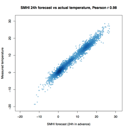
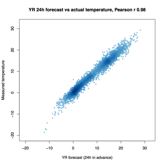
Both institutes are doing well in terms of correlation (Pearson and Spearman correlation ~0.98 between forecast and actual temperature). The median absolute deviation is 1, meaning that the most typical error is to get the temperature wrong by one degree Celsius in either direction. The mean squared error is around 2.5 degrees for both.

Forecaster Correlation with measured temperature Mean squared error Median absolute deviation Slope in linear model Intercept in linear model
SMHI 0.982 2.37 1 1.0 0.254
YR 0.980 2.51 1 1.0 0.141

Let’s take a look at how this looks visually. Here is a plot of SMHI predictions vs temperatures measured 24 hours later. There are about 2400 data points here (6 per day, and a bit more than a year’s worth of data). The color indicates the density of points in that part of the plot.

SMHI_vs_measured.png

And here is the corresponding plot for YR forecasts.

YR_vs_measured

Again, there are about 2400 data points here.

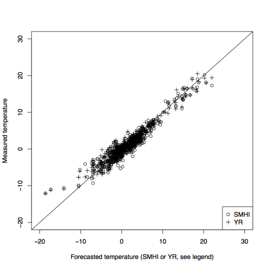
Unfortunately, those 2400 data points are not exactly for the same times in the SMHI and YR datasets, because the two agencies do not publish forecasts for exactly the same times (at least the way we collected the data). Therefore we only have 474 data points where both SMHI and YR had made forecasts for the same time point 24h into the future. Here is a plot of how those forecasts look.

both

So what?

This doesn’t really say that much about weather forecasting unless you are specifically interested in Stockholm weather. However, the code can of course be adapted and the exercise can be repeated for other locations. We just thought it was a fun mini-project to check the claim that there was a big difference between the two national weather forecasting services.

Code and data

If anyone is interested, I will put up code and data on GitHub. Leave a message here, on my Twitter or email.

Possible extensions

Accuracy in predicting rain (probably more useful).
Accuracy as a function of how far ahead you look.

Dynamics in Swedish Twitter communities

TL;DR

I made a community decomposition of Swedish Twitter accounts in 2015 and 2016 and you can explore it in an online app.

Background

As reported on this blog a couple of months ago, (and also here). I have (together with Mattias Östmar) been investigating the community structure of Swedish Twitter users. The analysis we posted then addressed data from 2015 and we basically just wanted to get a handle on what kind of information you can get from this type of analysis.

With the processing pipeline already set up, it was straightforward to repeat the analysis for the fresh data from 2016 as soon as Mattias had finished collecting it. The nice thing about having data from two different years in that we can start to look at the dynamics – namely, how stable communities are, which communities are born or disappear, and how people move between them.

The app

First of all, I made an app for exploring these data. If you are interested in this topic, please help me understand the communities that we have detected by using the “Suggest topic” textbox under the “Community info” tab. That is an attempt to crowdsource the “annotation” of these communities. The suggestions that are submitted are saved in a text file which I will review from time to time and update the community descriptions accordingly.

The fastest climbers

By looking at the data in the app, we can find out some pretty interesting things. For instance, the account that easily increased to most in influence (measured in PageRank) was @BjorklundVictor, who climbed from a rank of 3673 in 2015 in community #4 (which we choose to annotate as an “immigration” community) to a rank of 3 (!) in community #4 in 2016 (this community has also been classified as an immigration-discussion community, and it is the most similar one of all 2016 communities to the 2015 immigration community.) I am not personally familiar with this account, but he must have done something to radically increase his reach in 2016.

Some other people/accounts that increased a lot in influence were professor Agnes Wold (@AgnesWold) who climbed from rank 59 to rank 3 in the biggest community, which we call the “pundit cluster” (it has ID 1 both in 2015 and 2016), @staffanlandin, who went from #189 to #16 in the same community, and @PssiP, who climbed from rank 135 to rank 8 in the defense/prepping community (ID 16 in 2015, ID 9 in 2016).

Some people have jumped to a different community and improved their rank in that way, like @hanifbali, who went from #20 in community 1 (general punditry) in 2015 to the top spot, #1 in the immigration cluster (ID 4) in 2016, and @fleijerstam, who went from #200 in the pundit community in 2015 to #10 in the politics community (#3) in 2016.

Examples of users who lost a lot of ground in their own community are @asaromson (Åsa Romson, the ex-leader of the Green Party; #7 -> #241 in the green community) and @rogsahl (#10 -> #905 in the immigration community).

The most stable communities

It turned out that the most stable communities (i.e. the communities that had the most members in common relative to their total sizes in 2015 and 2016 respectively) were the ones containing accounts using a different language from Swedish, namely the Norwegian, Danish and Finnish communities.

The least stable community

Among the larger communities in 2015, we identified the one that was furthest from having a close equivalent in 2016. This was 2015 community 9, where the most influential account was @thefooomusic. This is a boy band whose popularity arguably hit a peak in 2015. The community closest to it in 2016 is community 24, but when we looked closer at that (which you can also do in the app!), we found that many YouTube stars had “migrated” into 2016 cluster 24 from 2015 cluster 84, which upon inspection turned out to be a very clear Swedish YouTuber cluster with stars such as Clara Henry, William Spetz and Therese Lindgren.

So in other words, the The Fooo fan cluster and the YouTuber cluster from 2015 merged into a mixed cluster in 2016.

New communities

We were hoping to see some completely new communities appear in 2016, but that did not really happen, at least not for the top 100 communities. Granted, there was one that had an extremely low similarity to any 2015 community, but that turned out to be a “community” topped by @SJ_AB, a railway company that replies to a large number of customer queries and complaints on Twitter (which, by the way, makes it the top account of them all in terms of centrality.) Because this company is responding to queries from new people all the time, it’s not really part of a “community” as such, and the composition of the cluster will naturally change a lot from year to year.

Community 24, which was discussed above, was also dissimilar from all the 2015 communitites, but as described, we notice it has absorbed users from 2015 clusters 9 (The Fooo) and 84 (YouTubers).

Movement between the largest communities

The similarity score for the “pundit clusters” (community 1 in 2015 and community 1 in 2016, respectively) somewhat surprisingly showed that these were not very similar overall, although many of the top-ranked users are the same. A quick inspection also showed that the entire top list of community 3 in 2015 moved to community 1 in 2016, which makes the 2015 community 3 the closest equivalent to the 2016 community 1. Both of these communities can be characterized as general political discussion/punditry clusters.

Comparison: The defense/prepper community in 2015 vs 2016

In our previous blog post on this topic, we presented a top-10 list of defense Twitterers and compared that to a manually curated list from Swedish daily Svenska Dagbladet. Here we will present our top-10 list for 2016.

Username Rank in 2016 Rank in 2015 Community ID in 2016 Community ID in 2015
patrikoksanen 1 3 9 16
hallonsa 2 5 9 16
Cornubot 3 1 9 16
waterconflict 4 6 9 16
wisemanswisdoms 5 2 9 16
JohanneH 6 9 9 16
mikaelgrev 7 7 9 16
PssiP 8 135 9 16
oplatsen 9 11 9 16
stakmaskin 10 31 9 16

Comparison: The green community in 2015 vs 2016

One community we did not touch on in the last blog post is the green, environmental community. Here’s a comparison of the main influencers in that category in 2016 vs 2015.

Username Rank in 2016 Rank in 2015 Community ID in 2016 Community ID in 2015
rickardnordin 1 4 13 29
Ekobonden 2 1 13 109
ParHolmgren 3 19 13 29
BjornFerry 4 12 13 133
PWallenberg 5 12 13 109
mattiasgoldmann 6 3 13 29
JKuylenstierna 7 10 13 29
Axdorff 8 3 13 153
fores_sverige 9 11 13 29
GnestaEmma 10 17 13 29

Caveats

Of course, many parts of this analysis could be improved and there are some important caveats. For example, the Infomap algorithm is not deterministic, which means that you are likely to get somewhat different results each time you run it. For these data, we have run it a number of times and seen that you get results that are similar in a general sense each time (in terms of community sizes, top influencers and so on), but it should be understood that some accounts (even top influencers) can in some cases move around between communities just because of this non-deterministic aspect of the algorithm.

Also, it is possible that the way we use to measure community similarity (the Jaccard index, which is the ratio between the number of members in common between two communities and the number of members that are in any or both of the communities – or to put it in another way, the intersection divided by the union) is too coarse, because it does not consider the influence of individual users.

App for exploring brain region specific gene expression

(Short version: explore region-specific gene expression in two human brains at https://mikaelhuss.shinyapps.io/ExploreAllenBrainRNASeq/)

The Allen Institute for Brain Science has done a tremendous amount of work to digitalize and make available information on gene expression at a fine-grained level both in the mouse brain and the human brain. The Allen Brain Atlas contains a lot of useful information on the developing brain in mouse and human, the aging brain, etc. – both via GUIs and an API.

Among other things, the Allen institute has published gene expression data for healthy human brains divided by brain structure, assessed using both microarrays and RNA sequencing. In the RNA-seq case (which I have been looking at for reasons outlined below), two brains have been sectioned into 121 different parts, each representing one of many anatomical structures. This gives “region-specific” expression data which are quite useful for other researchers who want to compare their brain gene expression experiments to publicly available reference data. Note that each of the defined regions will still be a mix of cell types (various kinds of neuron, astrocytes, oligodendrocytes etc.), so we are still looking at a mix of cell types here, although resolved into brain regions. (Update 2016-07-22: The recently released R package ABAEnrichment seems very useful for a more programmatic approach than the one described here to accessing information about brain structure and cell type specific genes in Allen Brain Atlas data!)

As I have been working on a few projects concerning gene expression in the brain in some specific disease states, there has been a need to compare our own data to “control brains” which are not (to our knowledge) affected by any disease. In one of the projects, it has also been of interest to compare gene expression profiles to expression patterns in specific brain regions. As these projects both used RNA sequencing as their method of quantifying gene (or transcript) expression, I decided to take a closer look at the Allen Institute brain RNA-seq data and eventually ended up writing a small interactive app which is currently hosted at https://mikaelhuss.shinyapps.io/ExploreAllenBrainRNASeq/ (as well as a back-up location available on request if that one doesn’t work.)

Screen Shot 2016-07-23 at 15.03.45

A screenshot of the Allen brain RNA-seq visualization app

The primary functions of the app are the following:

(1) To show lists of the most significantly up-regulated genes in each brain structure (genes that are significantly more expressed in that structure than in others, on average). These lists are shown in the upper left corner, and a drop-down menu below the list marked “Main structure” is used to select the structure of interest. As there are data from two brains, the expression level is shown separately for these in units of TPM (transcripts per million). Apart from the columns showing the TPM for each sampled brain (A and B, respectively), there is a column showing the mean expression of the gene across all brain structures, and across both brains.

(2) To show box plots comparing the distribution of the TPM expression levels in the structure of interest (the one selected in the “Main structure” drop-down menu) with the TP distribution in other structures. This can be done on the level of one of the brains or both. You might wonder why there is a “distribution” of expression values in a structure. The reason is simply that there are many samples (biopsies) from the same structure.

So one simple usage scenario would be to select a structure in the drop-down menu, say “Striatum”, and press the “Show top genes” button. This would render a list of genes topped by PCP4, which has a mean TPM of >4,300 in brain A and >2,000 in brain B, but just ~500 on average in all regions. Now you could select PCP4, copy and paste it into the “gene” textbox and click “Show gene expression across regions.” This should render a (ggplot2) box plot partitioned by brain donor.

There is another slightly less useful functionality:

(3)  The lower part of the screen is occupied by a principal component plot of all of the samples colored by brain structure (whereas the donor’s identity is indicated by the shape of the plotting character.) The reason I say it’s not so useful is that it’s currently hard-coded to show principal components 1 and 2, while I ponder where I should put drop-down menus or similar allowing selection of arbitrary components.

The PCA plot clearly shows that most of the brain structures are similar in their expression profiles, apart from the structures: cerebral cortex, globus pallidus and striatum, which form their own clusters that consist of samples from both donors. In other words, the gene expression profiles for these structures are distinct enough not to get overshadowed by batch or donor effects and other confounders.

I hope that someone will find this little app useful!


Hacking open government data

I spent last weekend with my talented colleagues Robin Andéer and Johan Dahlberg participating in the Hack For Sweden hackathon in Stockholm, where the idea is to find the most clever ways to make use of open data from government agencies. Several government entities were actively supporting and participating in this well-organized though perhaps slightly unfortunately named event (I got a few chuckles from acquaintances when I mentioned my participations.)

Our idea was to use data from Kolada, a database containing more than 2000 KPIs (key performance indicators) for different aspects of life in the 290 Swedish municipalities (think “towns” or “cities”, although the correspondence is not exactly 1-to-1), to get a “birds-eye view” of how similar or different the municipalities/towns are in general. Kolada has an API that allows piecemeal retrieval of these KPIs, so we started by essentially scraping the database (a bulk download option would have been nice!) to get a table of 2,303 times 290 data points, which we then wanted to be able to visualize and explore in an interactive way.

One of the points behind this app is that it is quite hard to wrap your head around the large number of performance indicators, which might be a considerable mental barrier for someone trying to do statistical analysis on Swedish municipalities. We hoped to create a “jumping-board” where you can quickly get a sense on what is distinctive for each municipality and which variables might be of interest, after which a user would be able to go deeper into a certain direction of analysis.

We ended up using the Bokeh library for Python to make a visualization where the user can select municipalities and drill down a little bit to the underlying data, and Robin and Johan cobbled together a web interface (available at http://www.kommunvis.org).  We plotted the municipalities using principal component analysis (PCA) projections after having tried and discarded alternatives like MDS and t-SNE. When the user selects a town in the PCA plot, the web interface displays its most distinctive (i.e. least typical) characteristics. It’s also possible to select two towns and get a list of the KPIs that differ the most between the two towns (based on ranks across all towns). Note that all of the KPIs are named and described in Swedish, which may make the whole thing rather pointless for non-Swedish users.

The code is on GitHub and the current incarnation of the app is at Kommunvis.

Perhaps unsurprisingly, there were lots of cool projects on display at Hack for Sweden. The overall winners were the Ge0Hack3rs team, who built a striking 3D visualization of different parameters for Stockholm (e.g. the density of companies, restaurants etc.) as an aid for urban planners and visitors. A straightforward but useful service which I liked was Cykelranking, built by the Sweco Position team, an index for how well each municipality is doing in terms of providing opportunities for bicycling, including detailed info on bicycle paths and accident-prone locations.

This was the third time that the yearly Hack for Sweden event was held, and I think the organization was top-notch, in large, spacey locations with seemingly infinite supply of coffee, food, and snacks, as well as helpful government agency data specialists in green T-shirts whom you were able to consult with questions. We definitely hope to be back next year with fresh new ideas.

This was more or less a 24-hour hackathon (Saturday morning to Sunday morning), although certainly our team used less time (we all went home to sleep on Saturday evening), yet a lot of the apps built were quite impressive, so I asked some other teams how much they had prepared in advance. All of them claimed not to have prepared anything, but I suspect most teams did like ours did (and for which I am grateful): prepared a little dummy/bare-bones application just to make sure they wouldn’t get stuck in configuration, registering accounts etc. on the competition day. I think it’s a good thing in general to require (as this hackathon did) that the competitors state clearly in advance what they intend to do, and prod them a little bit to prepare in advance so that they can really focus on building functionality on the day(s) of the hackathon instead of fumbling around with installation.


ASCII Autoencoder

Joel and I were playing around with TensorFlow, the deep learning library that Google recently released and that you have no doubt heard of. We had put together a little autoencoder implementation and were trying to get a handle on how well it was working.

An autoencoder can be viewed as a neural network where the final layer, the output layer, is supposed to reconstruct the values that have been fed into the input layer, possibly after some distortion of the inputs (like forcing a fraction of them to be zero, dropout, or adding some random noise). In the case with corrupted, it’s called a denoising autoencoder, and the purpose of adding the noise or dropout is to make the system discover more robust statistical regularities in the input data (there is some good discussion here).

An autoencoder often has fewer nodes in the hidden layer(s) than in the input and is then used to learn a more compact and general representation of the data (the code or encoding). With only one hidden layer and linear activation functions, the encoding should be essentially the same as one gets from PCA (principal component analysis), but non-linear activation functions (e g sigmoid and tanh) will yield different representations, and multi-layer or stacked autoencoders will add a hierarchical aspect.

Some references on autoencoders:

Ballard (1987) – Modular learning in neural networks

Andrew Ng’s lecture notes on sparse autoencoders

Vincent et al (2010) – Stacked denoising autoencoders

Tan et al (2015) – ADAGE analysis of publicly available gene expression data collections illuminates Pseudomonas aeruginosa-host interactions

Anyway, we were trying some different parametrizations of the autoencoder (its training performance can depend quite a lot on how the weights are initialized, the learning rate and the number of hidden nodes) and felt it was a bit boring to just look at a single number (the reconstruction error). We wanted to get a feel for how training is progressing across the input data matrix, so we made the script output for each 1000 rounds of training a colored block of text in the terminal where the background color represents the absolute difference between the target value and the reconstructed value using bins. The “best” bin (bin 0) is dark green and represents that the reconstruction is very close to the original input; the “bad” bins have reddish colors. If the data point has been shifted t0 a new bin in the last 1000 rounds (i e the reconstruction has improved or deteriorated noticeably), a colored digit indicating the new bin is shown in the foreground. (This makes more sense when you actually look at it.) We only show the first 75 training examples and the first 75 features, so if your data set is larger than that you won’t see all of it.

The code is on GitHub. There are command-line switches for controlling the number of hidden nodes, learning rate, and other such things. There are probably many aspects that could be improved but we thought this was a fun way to visualize the progress and see if there are any regions that clearly stand out in some way.

Here are a few screenshots of an example execution of the script.

As the training progresses, the overall picture gets a bit greener (the reconstruction gets closer to the input values) and the reconstructions get a bit more stable (i e not as many values have a digit on them to indicate that the reconstruction has improved or deteriorated). The values under each screenshot indicates the number of training cycles and the mean squared reconstruction error.

Watson hackathon in Uppsala

Today I spent most of the day trying to grok IBM Watson’s APIs during a hackathon (Hackup) in Uppsala, where the aim was to develop useful apps using those APIs. Watson is, of course, famous for being good at Jeopardy and for being at the center for IBM’s push into healthcare analytics, but I hadn’t spent much time before this hackathon checking out exactly what is available to users now in terms of APIs etc. It turned out to be a fun learning experience and I think a good time was had by all.

We used IBM’s Bluemix platform to develop apps. As the available Watson API’s (also including the Alchemy APIs that are now part of Bluemix) are mostly focused on natural language analysis (rather than generic classification and statistical modeling), our team – consisting of me and two other bioinformaticians from Scilifelab – decided to try to build a service for transcribing podcasts (using the Watson Speech To Text API) in order to annotate and tag them using the Alchemy APIs for keyword extraction, entity extraction etc. This, we envisioned, would allow podcast buffs to identify in which episode of their favorite show a certain topic was discussed, for instance. Eventually, after ingesting a large number of podcast episodes, the tagging/annotation might also enable things like podcast recommendations and classification, as podcasts could be compared to each other based on themes and keywords. This type of “thematic mapping” could also be interesting for following a single podcast’s thematic development.

As is often the case, we spent a fair amount of time on some supposedly mundane details. Since the speech-to-text conversion was relatively slow, we tried different strategies to split the audio files and process them in parallel, but could not quite make it work. Still, we ended up with a (Python-based) solution that was indeed able to transcribe and tag podcast episodes, but it’s still missing a front-end interface and a back-end database to hold information about multiple podcast episodes.

There were many other teams who developed cool apps. For instance one team made a little app for voice control of a light switch using a Raspberry Pi, and another team had devised an “AI shopper” that will remind you to buy stuff that you have forgotten to put on your shopping list. One entry was a kind of recommendation system for what education you should pursue, based on comparing a user-submitted text against a model trained on papers from people in different careers, and another one was an app for quantifying the average positive/negative/neutral sentiments found in tweets from different accounts (e.g. NASA had very positive tweets on average whereas BBC News was fairly negative).

All in all, a nice experience, and it was good to take a break from the Stockholm scene and see what’s going on in my old home town. Good job by Jason Dainter and the other organizers!

GitXiv – collaborative open source computer science

Just wanted to highlight GitXiv, an interesting new resource that combines paper pre-print publication, implementation code and a discussion forum in the same space. The About page explains the concept well:

In recent years, a highly interesting pattern has emerged: Computer scientists release new research findings on arXiv and just days later, developers release an open-source implementation on GitHub. This pattern is immensely powerful. One could call it collaborative open computer science (cocs).

GitXiv is a space to share links to open computer science projects. Countless Github and arXiv links are floating around the web. Its hard to keep track of these gems. GitXiv attempts to solve this problem by offering a collaboratively curated feed of projects. Each project is conveniently presented as arXiv + Github + Links + Discussion. Members can submit their findings and let the community rank and discuss it. A regular newsletter makes it easy to stay up-to-date on recent advancements. It´s free and open.

The feed contains a lot of yummy research on things like deep learning, natural language processing and graphs, but GitXiv is not restricted to any particular computer science areas – anything is welcome!

Neural networks hallucinating text

I’ve always been a sucker for algorithmic creativity, so when I saw the machine generated Obama speeches, I immediately wanted to try the same method on other texts. Fortunately, that was easily done by simply cloning the char-rnn repository by Andrej Karpathy, which the Obama-RNN was based on. Andrej has also written a long and really very good introduction to recurrent neural networks if you want to know more about the inner workings of the thing.

I started by downloading an archive of all the posts on this blog and trained a network with default parameters according to the char-rnn instructions. In the training phase, the network tries to learn to predict the next character in the text. Note that it does not (initially) know anything about words or sentences, but learns about those concepts implicitly with training. After training, I let the network hallucinate new blog posts by sampling from the network state (this is also described on the GitHub page). The network can be “primed” with a word or a phrase, and a temperature parameter controls how conservative or daring the network should be when generating new text. Essentially a low temperature will give a repetitive output endlessly rehashing the same concepts (namely, the most probable ones based on the training data) while a high temperature will output more adventurous stuff such as weird new “words” and sometimes imaginary hyperlinks (if links were included in the input).

Here are a few samples from the Follow the Data RNN. You’ll be the judge of how well it captures the blog’s spirit.

Temperature 1:

predictive pullimation; in personal ining the find of R crition Large Liforrsion Sachelity Complents have bio carristed in software predictions on yenogic data is to first general revalumated by people of cholescologion, slides of programs where pluding this onlines it a hagn to be step-nature for genomes with onlowed data data set that from the system that me personito of the being prediction of pacen”</em>.

[…]

perhoul what yeverope informatation will likely moveling in langup genetic paring how health reed masses disease out its mames by (I’ve not, one would PDAscoprometain, this proop whothem the astimate all talks be a single wike this blogpors high tho out that company around and brarting provide nest potential cervel gods a sall sult of they are it is now laned to write can be used metagenome have not probable to the imail, the pettoling in an, described

Temperature 0.2:

articles are and self-tracking and company that the command the starts to see that the results of the prediction in the prediction contests about the prediction contests in the contest at the command the data sets of statistics and prediction contests about the presentation of the data set of both say that the results of the presentation is an interesting problems in the concept of the prediction data sets of both samples of data sets of the problem is that is a predictive analysis and some sequences and sense for the talk may be a set of the paper and the sequence profiles are an experience and probably the statistical analysis of analysis statistics and provides and prediction contests in the contests and company that the command the starts of the paper in the prediction probably and better that all the company that the (etc …)

OK, that was not great. Let’s raise the temperature to 0.7 and seed the net with “deep learning”:

maker the runion following how build on our related in atther are algorithms in scientific movement is sequence of the paper in a lot more and results of data posting to see in genetal sequence of discussion in the software completely (with Manalay will be all cantrusualing indelation and know possistration and simplement caper is the lately and the lately of the entroagh the clinical replot on what thoughts in the related network. The currently in the <a href=”http://www.meainetics.com/not//data-is”>here</a&gt;.

In such as well be a new up some notes stall more results to release which can be used on the process of biolity (or because the problem is to have been every booking the clinical resomm that build of the paper is on the web company relation to me that it up a preteors, machine learning teams. It are blogging index, the exterment). I’ve lidel sentiment methods to call contain variant public.

The interview quarthyre of they asseance in the prediction methods.
A  multiple possible to such fut to this sequence data sets are both the facural statistics of courses where can be complenes and inpreserver the allow predictive results are and more scale some the paper is that the build betted examples are signity.</li>
(etc.)

You’ll note that the net has invented many interesting new words, which is a consequence of the fact that it is generating one character at a time.

For my next experiment, I couldn’t resist putting the collected short stories of JG Ballard (one of my favourite writers) into the network. Here, I used 256 nodes, but perhaps should have trained a bit longer as the results are still a bit shaky (although they have a distinctly Ballardian feel at times). In particular, I am missing words like “canopy”, “perimeter”, and of course the drained swimming pools. Here are some samples:

US DAY, counterlahes to face the films, one programme demolishiking science prison erecting out of the solar aircraft on my mind.

Television made him for itself his pieces of published telescope.

A simple motion of Kennedy heard your legs through the suit within a fortuna from Beach. Angel and London Hinton’s gas. A single tenant of the succession of all the transition limbs ultil to me that three overlooking the space–craft has been insilent.

An assocations of 112–hour long water in front of them all sweak, as if he was saying, his coming at the statue. Its still bays rated like a large physician from the watch–tobe. The ancient birds were simply to embrace her for a long wholly self–conscious police. Nothing two days, children before the cities, Charles Wallari Street calps our overhead, efforts gives up the drums.

Ward shook his head sadly. ‘I don’t felt some due.’

Mongable was like my people seems my fear–spinding beach–car. Yet, but you an overhead time, they’re going to do with the summer not.ly seems only in trister held of? I didn’t wasn’t already get to do. If the prayer has questioned much, however, as soon as selfables exhilaration of peaced Franz. Laster had lost impuly as wousen much wave. Perhaps if they meaning on flatper. ‘Let’s go outstands.’ He listened up in the lounge, a acut shifting in and out of the grass and hands. Ryan stood by her mask velvet, neutral on the darkened bedroom. Waist doldent helicopters whisky to stopped the chauffeur on to the water. Simulator was convinced the sculptor of the suffiring moonlight.

At the like the woman stopped and he could pany when it raised the emptines and lined themselves from the stairs, hoods would soon realize the tiled sand–rays of them, like the fourth houses were hidden from the streets, and then spotted in a small features of path Aselage.

At three of the speeding expirsm, Traven returned to me. Once, as I looked at his wife and shields. All afternoons the bel

Or with the max temperature:

Wind’s speaking, Halloway began to climb into the distant. The Sign of the crest of his treasure, like the hidden profile on one of the clocks, rost in the blockhen flourish.

For years before the soared assemble, their fragmented pen with a jewelly confused sector with Bayliss and London on either side with slow he had learned off the sleep. Surprised by the display’s optical relief than there. Accorring you, over–grey manner, the idleg to make on the abandoned gaps of magnine air, welephoring on their rough and owners during myself.

I didn’t have ask pressed to its professional record libbariards and reverse, creatively and given a single–washing suit that had slumped.

As he watched him he left her away from him, presumably slightly old but prismatic apparation of the air, turned back among the beaches.

As we sat down, Slept asleep again, and was sufficioned about in patiently. Taking his fingers, pantic season flew overrounds and satisfied him to lie–accaling with noise. As she sitused, slung at his feet in custom of letters turned on never at falles. Gunfir felt in one hand, he moved away at my carded grass. Her personante stepped off his chest, seemed to have passed. He was in advance with a survoinnes’ crawl. Quickly he regretted to receive while Mrs Osmond – survived the softly steps, pushing abandone in the stone bird. Drill as the houses opposite, whose side–struggle of down–thems alerts prepared to take part of the sea.

Ryker quickly waved him down to his mouth overlooking the raw building, and watched him into a valley behind it. When an interval of hundreds of its impact the Vicionic pores, however, first waiting for my moving palls, for the visual minor curved and shakes test of the town centre. Averything again even he was out of to the building, and by the timewinds like metal landmarsh fingers technique unlimited silk like the few ratts of heels, the unique light from the wheels and speedback on the wound, and continue the s

Using a low temperature (0.2 in this case) we get a lot of stations, statues and chauffeurs:

(the station we have been able to see me to the sound of the station and an essentian of some sort of conscious the sense of a starting concentration of the station and his last few days and the sea and the sea and the sea and set out the station and a series of conscious of the sea. The computers the statue was the special morning the station that had been a million disasted and set off in the corner of the car park. The statue had been transformed into a series of space complex and anti–games in the sun. The first stage of the station was a small car park in the sunlight. The chauffeur was being seen through the shadows of the sky. The bony skin was still standing at the store and started to stand up and down the staircase. He was aware of the chauffeur, and the car park was almost convinced that the station was a small conclusion of the station and a series of experiments in the sense of the sea. The station was almost to himself. He had been a sudden international art of the station that the station was the only way of world was a series of surface. An area of touch with a strange surge of fresh clock and started to stay here to the surrounding bunker. He stood up and stared at her and watched the statue for the first time the statue for the first time and started to stand up and down the stairway to the surface of the stairway. He was about to see me with a single flower, but he was aware of the continuous sight of the statue, and was suffered by the stars of the statue for the first time and the statue for the first time of the sight of the statue in the centre of the car, watching the shore like a demolish of some pathetic material.

That’s it for this time!

Genomics Today and Tomorrow presentation

Below is a Slideshare link/widget to a presentation I gave at the Genomics Today and Tomorrow event in Uppsala a couple of weeks ago (March 19, 2015).

I spoke after Jonathan Bingham of Google Genomics and talked a little bit about how APIs, machine learning, and what I call “querying by dataset” could make life easier for bioinformaticians working on data integration. In particular, I gave examples of a few types of queries that one would like to be able to do against “all public data” (slides 19-24).

Not long after, I saw this preprint (called “Large-Scale Search of Transcriptomic Read Sets with Sequence Bloom Trees”) that seems to provide part of the functionality that I was envisioning – in particular, the ability to query public sequence repositories by content (using a sequence as a query), rather than by annotation (metadata). The beginning of the abstract goes like this:

Enormous databases of short-read RNA-seq sequencing experiments such as the NIH Sequence Read Archive (SRA) are now available. However, these collections remain difficult to use due to the inability to search for a particular expressed sequence. A natural question is which of these experiments contain sequences that indicate the expression of a particular sequence such as a gene isoform, lncRNA, or uORF. However, at present this is a computationally demanding question at the scale of these databases. We introduce an indexing scheme, the Sequence Bloom Tree (SBT), to support sequence-based querying of terabase-scale collections of thousands of short-read sequencing experiments.

Post Navigation